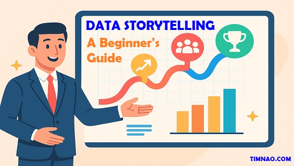
🚀 Transform Data into Powerful Stories: The Beginner’s Guide to Business Impact
Data storytelling is one of the most powerful skills you can learn in today’s business world. Numbers alone rarely inspire action, but when you transform them into stories, they become memorable, persuasive, and impactful. Whether you’re a small business owner presenting last month’s sales, a marketer pitching a new campaign, or a beginner just learning how to make sense of spreadsheets, storytelling with data can help you stand out.
Think about it: a spreadsheet full of numbers might be ignored, but a simple chart showing how your product sales doubled after a campaign can spark excitement and win support instantly. That’s the magic of data storytelling—it bridges the gap between analysis and action.
In this beginner-friendly guide, you’ll discover practical strategies, tools, and real-world examples to turn raw data into compelling stories that drive decisions. From choosing the right chart to understanding your audience, every step is explained in simple terms, with plenty of actionable tips to help you start strong.
Now, let’s dive in and explore how you can master the art of data storytelling to boost your business impact.
Table of Contents
- 📊 Why Data Storytelling Matters for Beginners
- 🧠 The Science Behind Visual Communication
- 🎯 Defining Data Storytelling in Simple Terms
- 🛠️ Beginner-Friendly Tools to Get Started
- 👥 Understanding and Engaging Your Audience
- 🖼️ Design Principles That Make Your Visuals Pop
- 📈 Choosing the Right Chart for the Right Story
- 🌍 Real-World Examples Across Industries
- ⚡ Common Mistakes and How to Avoid Them
- 🔮 The Future of Data Storytelling for Businesses
- 🛤️ Action Plan: Your First Steps Today
- 🙋 FAQs: Beginner Questions About Data Storytelling Answered
📊 Why Data Storytelling Matters for Beginners
If you’re just starting your career or running a small business, you might think data storytelling is something only big companies or advanced analysts do. In reality, it’s one of the most valuable skills you can learn right now—no matter your role or level of experience.
Here’s the truth: businesses today are drowning in data. From website visits and online purchases to customer reviews and social media likes, information is everywhere. But most of this data sits untouched because people don’t know how to make sense of it. That’s where data storytelling comes in.
From Raw Numbers to Clear Messages
Imagine you’re a marketing assistant asked to share last month’s campaign performance. You could send your manager a spreadsheet with thousands of rows. But chances are, they won’t have the time or patience to dig through it.
Now, imagine turning that same data into a bar chart that compares the performance of each channel—email, social media, paid ads, and referrals. With a quick glance, your manager sees that social media drove the most sign-ups. Add a short note explaining why that channel worked best, and suddenly you’ve told a story that leads to action: “Let’s invest more in social media ads next month.”
That’s the power of storytelling with data—it makes your message clear, quick, and convincing.
Why Beginners Should Care
For beginners, learning data storytelling can give you a huge career advantage. Here’s why:
- It helps you stand out. Anyone can collect data, but not everyone can explain it in a way that grabs attention. When you master this skill, your reports, presentations, and ideas will instantly look more professional.
- It builds confidence. Instead of worrying about “dumping too much information,” you’ll know exactly how to highlight what matters most.
- It drives decisions. Whether you’re trying to convince your boss to approve a budget, or showing a client why your idea will work, data storytelling makes your case stronger.
- It works everywhere. From school projects and small startups to global corporations, the ability to explain numbers with clarity is always useful.
A Real-World Example
During the COVID-19 pandemic, many governments published daily updates with plain numbers—new cases, deaths, recoveries. These reports were important but often confusing to the public. On the other hand, when the same information was shown in simple line graphs or maps, people understood trends more easily. They could see if cases were rising or falling in their area, which helped them make informed decisions about travel, work, or social gatherings.
This example shows that data storytelling isn’t just for businesses—it’s a skill that affects everyday life, too.
🧠 The Science Behind Visual Communication
To understand why storytelling with data works so well, we need to look at how our brains process information. Humans are naturally visual creatures. Long before we learned to read or write, we relied on images and patterns for survival—spotting ripe fruit, watching animal movements, or noticing a storm in the sky.
Why Our Brains Love Visuals
Research shows that people remember 65% of visual content after three days, compared to just 10% of text. Here’s why visuals are so powerful:
- Pattern recognition: Our brains can instantly see trends, like a line going up or down.
- Faster processing: We can interpret images in milliseconds, while reading numbers takes much longer.
- Emotional impact: Colors, shapes, and images trigger feelings that numbers alone cannot.
This is why a chart showing rising costs will feel more urgent than simply saying “expenses increased by 20%.”
How Visuals Improve Business Communication
Consider two scenarios:
- Scenario A: You present a table of raw numbers showing monthly sales. Your audience politely scans it, but they’re not engaged.
- Scenario B: You show a line graph of monthly sales with a sharp dip in April and a rebound in May. Instantly, everyone sees the problem and wants to know why.
The second scenario works because the brain processes the story behind the numbers much faster.
The Role of Emotions in Decision-Making
We often think business decisions are purely logical, but emotions play a big role. Visuals help connect data to feelings:
- Red highlights can show danger or losses.
- Green growth lines can create excitement.
- Customer photos with testimonials can make data feel human and relatable.
By combining numbers with visuals and narrative, you’re not just presenting information—you’re creating an experience your audience remembers.
Dashboards: The Modern Data Storytelling Tool
One of the most practical applications of visual communication is the business dashboard. Think of it as a car dashboard, but for data. It shows the most important metrics at a glance.
A marketing dashboard might include:
- A bar chart of ad performance by channel
- A line chart of website traffic over time
- A pie chart showing customer sources
- A heatmap highlighting geographic sales
By combining these visuals, anyone—regardless of technical knowledge—can see what’s working and what needs attention.
Tools like Tableau, Power BI, and even Google Data Studio make it easy to build interactive dashboards where users can explore data themselves. For beginners, even Excel or Google Sheets can create mini-dashboards that impress stakeholders.
A Beginner-Friendly Exercise
Here’s a simple way to practice visual communication:
- Open Google Sheets and enter sales numbers for the last 6 months.
- Highlight the data and insert a line chart.
- Add a title like “Monthly Sales Trend.”
- Notice how much clearer the story becomes compared to looking at raw numbers.
This small exercise shows you how visuals instantly transform data into a story your brain understands.
Bringing It All Together
At this stage, the main idea is simple: data storytelling makes your message clearer, faster to understand, and far more persuasive. By turning raw numbers into visuals and weaving them into a short narrative, you help others see not just what happened, but why it matters.
Our brains are wired for visuals, which is why a simple chart or dashboard often communicates more than a long report. The combination of data, design, and story creates insights people remember—and act on.
In the next section, we’ll explore the practical tools and techniques you can start using right away to bring your own data stories to life.
🎯 Defining Data Storytelling in Simple Terms
If the term data storytelling sounds complicated, don’t worry—it’s much simpler than it seems. At its core, data storytelling is the art of taking raw numbers and turning them into a narrative that people can understand, remember, and act on.
Think about it like cooking. Data is the raw ingredient, visuals are the recipe, and the story is the final dish. Without the story, your audience just sees a pile of ingredients and may not know what to do with them. With the story, everything comes together into something meaningful and enjoyable.
The Three Pillars of Data Storytelling
To make sense of data storytelling, imagine it as a structure built on three main pillars:
- Data (the facts)
- This is the raw information—sales figures, survey results, website visits, customer feedback, or financial metrics. Data gives credibility to your story.
- Visuals (the design)
- Charts, graphs, infographics, or dashboards that make the data easier to process. Visuals allow people to “see” the story quickly.
- Narrative (the explanation)
- This is the glue that connects data and visuals. It answers the why behind the numbers. Why did sales go up? Why are customers leaving? Why is one product outperforming the others?
When these three work together, you don’t just present numbers—you deliver an insight.
A Simple Example
Imagine you run a small online bakery. In January, you sold 200 cakes, in February 250, and in March 400. On its own, those numbers don’t say much.
But when you plot them into a line chart, the upward trend becomes obvious. Add a short narrative—“We introduced a new flavor in February, which boosted sales significantly”—and suddenly your audience understands both what happened and why it matters.
That’s data storytelling in action.
Why Keep It Simple?
Beginners often feel they need to impress with complex charts or technical jargon. In reality, simplicity is more powerful. A clean bar chart and a one-sentence explanation will always beat a cluttered infographic full of numbers that no one can follow.
The golden rule: Clarity beats complexity.
🛠️ Beginner-Friendly Tools to Get Started
The idea of working with data might sound intimidating if you’re not a data analyst, but here’s the good news: you don’t need to be one. Today, there are plenty of tools—many of them free—that make it easy to create visuals and tell stories with your data. Let’s look at some beginner-friendly options.
1. Google Sheets or Excel (Perfect for Starters)
If you’re just beginning, start with what you already know. Both Google Sheets and Microsoft Excel are excellent entry-level tools for data storytelling.
- Why use them?
They’re easy to access, widely used, and come with built-in charting features. You can turn rows of data into bar charts, line graphs, or pie charts in seconds. - Beginner exercise:
Track your personal expenses for one month in Google Sheets. Then, create a pie chart showing where your money went (food, rent, transport, entertainment). You’ll quickly see your spending habits in a way that’s much clearer than just looking at a list of numbers.
2. Canva (For Visual Storytelling Without Design Skills)
Not everyone wants to fiddle with spreadsheets. That’s where Canva shines. Canva is a drag-and-drop design tool that lets you build professional-looking infographics and charts even if you have zero design background.
- Why use it?
It comes with ready-made templates for reports, presentations, and data visualizations. You can customize colors, fonts, and icons to make your data look engaging. - Beginner exercise:
Take the expense pie chart you made in Sheets and upload it into Canva. Add icons, labels, and a title like “How I Spent My Money in March.” Suddenly, you have a shareable visual story you can post on social media or include in a presentation.
3. Google Data Studio (Now Looker Studio)
Google Looker Studio is a free and powerful tool for building interactive dashboards. It’s more advanced than Google Sheets but still beginner-friendly once you get used to it.
- Why use it?
It connects directly to Google Analytics, YouTube, Google Ads, and spreadsheets, allowing you to pull live data. You can then create real-time dashboards that update automatically. - Beginner exercise:
Connect Looker Studio to your website’s Google Analytics. Create a dashboard showing total visitors, most popular pages, and traffic sources. This gives you a story about how people are finding your site and what they care about most.
4. Tableau Public (For Interactive Stories)
Tableau Public is another excellent tool if you want to go beyond simple charts. It’s widely used in business and allows you to build interactive visualizations.
- Why use it?
It’s free for public projects and has a drag-and-drop interface that makes exploring data less intimidating. You can publish your stories online for others to explore. - Beginner exercise:
Download Tableau Public and import a simple dataset, like world population by country. Create a map visualization where users can hover over each country to see its population. You’ve now built an interactive data story.
5. Power BI (For Business Use Cases)
If you’re planning to use data storytelling professionally, especially in a corporate environment, Microsoft Power BI is worth learning.
- Why use it?
It integrates seamlessly with Microsoft products, handles large datasets, and allows you to create polished dashboards. Many companies already use it for reporting, so knowing Power BI can be a career booster. - Beginner exercise:
Use Power BI to import an Excel file of sales data. Build a dashboard showing total revenue, top-selling products, and regional performance. This gives you a polished business story ready to present to managers.
Tips for Choosing the Right Tool
With so many tools available, beginners often feel overwhelmed. Here’s how to decide:
- If you’re brand new: Start with Google Sheets or Excel.
- If you want polished visuals for sharing: Try Canva.
- If you want interactive dashboards: Experiment with Google Looker Studio or Tableau Public.
- If you’re aiming for corporate use: Learn Power BI.
The key is to start small. You don’t need to master everything at once. Begin with one tool, practice simple charts, and build confidence step by step.
Defining data storytelling doesn’t mean memorizing technical terms—it simply means seeing data as a story you can share. Once you understand the three building blocks—data, visuals, and narrative—you can start practicing right away with simple, beginner-friendly tools.
Whether it’s a pie chart in Google Sheets, an infographic in Canva, or a dashboard in Looker Studio, the goal is the same: make information clear and memorable. And the more you experiment with these tools, the more confident you’ll become in shaping data into stories that spark action.
In the next section, we’ll explore how design choices and storytelling techniques can elevate your visuals, making them not just easy to read but truly captivating.
👥 Understanding and Engaging Your Audience
One of the biggest mistakes beginners make in data storytelling is focusing too much on the data itself and forgetting about the people who will see it. The truth is, the most important part of your story isn’t the numbers—it’s the audience.
When you tailor your story to the people listening, your message becomes clearer and more persuasive. If you don’t, even the best-looking chart can fall flat.
Start With the “Who”
Before you create any chart or report, ask yourself: Who am I talking to? Different audiences need different levels of detail.
- Executives and decision-makers usually want the “big picture.” They care about trends, outcomes, and what actions to take next. A simple dashboard or one strong chart often works best here.
- Team members and colleagues may want more details. They’re closer to the work and need to understand the “how” and “why.” In this case, you might include supporting charts or breakdowns.
- Customers or the general public need simplicity and clarity. If your visuals are too technical, they’ll tune out. Focus on making the message relatable, not complicated.
Ask the Right Questions
To connect with your audience, think about the questions they might have:
- What problem are they trying to solve?
- What decision do they need to make?
- How much background knowledge do they already have?
- What’s the single most important message they should walk away with?
If you can answer these questions, you’ll know how to shape your story.
Speak Their Language
Numbers can feel cold or distant. To bridge the gap, use language your audience understands. For example:
- Instead of saying, “Revenue increased by 20% in Q2,” you could say, “For every $10 we earned last quarter, we’re now earning $12.”
- Instead of saying, “Customer churn decreased by 5%,” try, “More of our customers are staying with us compared to last quarter.”
Framing your message in familiar terms makes it easier for people to relate to the story.
Make It About Them
Data storytelling becomes powerful when you show how the numbers impact the audience directly. For example:
- If you’re talking to a sales team, show how leads grew because of their efforts.
- If you’re addressing investors, highlight how revenue growth strengthens company value.
- If you’re sharing with customers, explain how improvements benefit their experience.
When people see themselves in the story, they care more about the outcome.
🖼️ Design Principles That Make Your Visuals Pop
Once you’ve considered your audience, the next step is to make your visuals clear and engaging. You don’t need to be a professional designer—just follow a few simple principles to make your charts, dashboards, or infographics stand out.
1. Keep It Simple
Clutter is the enemy of good design. Beginners often cram too many numbers, colors, or chart types into one visual. Instead, ask yourself: What’s the one message I want this chart to deliver?
- Use one chart per message instead of trying to explain everything at once.
- Avoid unnecessary gridlines, 3D effects, or decorations that distract from the data.
- Stick to clear, minimal layouts.
2. Choose the Right Chart
Different charts tell different stories. Picking the right one is crucial.
- Line chart: Best for showing changes over time (e.g., sales growth across months).
- Bar chart: Great for comparing categories (e.g., revenue by product).
- Pie chart: Use sparingly, only to show proportions of a whole.
- Scatter plot: Useful for showing relationships between two variables.
Tip: If your audience struggles with numbers, stick with line and bar charts. They’re easiest to understand at a glance.
3. Use Color With Purpose
Color can either clarify your message or confuse your audience. Use it wisely.
- Highlight the most important data point with a bright color, while keeping the rest neutral.
- Use consistent colors across charts (e.g., always blue for revenue, green for profit).
- Avoid rainbow palettes that make the chart look busy.
Example: If you want to emphasize that one product is outselling the rest, use bold red for that bar and gray for all others. The message becomes instantly clear.
4. Tell a Visual Story
Think of your charts as scenes in a movie. Each one should flow naturally into the next, guiding your audience through the story.
For instance:
- Start with a chart that sets the stage (e.g., overall sales trend).
- Then zoom into the detail (e.g., sales by region).
- Finally, highlight the action point (e.g., regions with highest potential growth).
This step-by-step approach makes your visuals feel like a journey rather than random snapshots.
5. Add Context
A chart without context can be misleading. Always label clearly and explain what the numbers mean.
- Add descriptive titles like “Sales Growth After New Product Launch” instead of just “Sales.”
- Use captions or callouts to explain spikes or drops in the chart.
- Include benchmarks if possible (e.g., comparing this year’s revenue to last year’s).
Context ensures your audience not only sees the data but also understands the “so what.”
6. Test Before You Share
Finally, always test your visuals before presenting them. Show them to a colleague or friend who isn’t familiar with the data. Ask: “What’s the first thing you notice?” or “What do you think this chart is saying?”
If they get the intended message quickly, you’re on the right track. If not, simplify further.
Engaging your audience is really about empathy—knowing what they care about and showing them how the numbers connect to their world. When you combine that awareness with clean, simple design choices, your visuals stop being “just charts” and start becoming messages that people pay attention to. Done right, your data doesn’t just inform—it sparks curiosity and drives action.
📈 Choosing the Right Chart for the Right Story
A chart is more than a pretty picture—it’s a tool for communicating meaning. But here’s the catch: the same dataset can tell completely different stories depending on which chart you use. For beginners, picking the right chart often feels overwhelming, but it doesn’t have to be. The key is to think about the story you want your data to tell before choosing the visualization.
If you’ve ever sat through a presentation where the chart was confusing, too busy, or didn’t seem to answer any question, you’ve experienced what happens when the wrong chart is used. The good news is that you can avoid this mistake by learning the strengths of the most common chart types and when to use them.
Step 1: Identify the Purpose of Your Story
Before choosing a chart, ask yourself: What am I trying to show? Most data stories fall into one of these categories:
- Comparison – comparing different categories or groups.
- Change Over Time – showing trends or progress.
- Composition – showing how parts make up a whole.
- Relationship – showing how two or more variables relate to each other.
- Distribution – showing how values are spread out.
Once you know the purpose, the chart choice becomes much easier.
Step 2: Match the Chart to the Purpose
Here are the most useful beginner-friendly chart types and when to use them.
1. Bar Chart (Best for Comparison)
Bar charts are simple, clear, and widely understood. They are your go-to choice when you want to compare categories.
- Use when: Comparing sales by product, website traffic by source, or survey responses by group.
- Example: A small café might compare monthly coffee sales vs. pastry sales using a bar chart. It quickly shows which item performs better.
- Pro tip: Keep bars horizontal if you have long category names.
2. Line Chart (Best for Trends Over Time)
Line charts shine when you want to show changes or progress. They make it easy to spot upward or downward trends.
- Use when: Tracking monthly revenue, website visits over a year, or temperature changes across seasons.
- Example: A blogger could plot traffic growth from January to December, clearly showing which months had spikes.
- Pro tip: Don’t overload with too many lines—stick to 2–3 at most to avoid confusion.
3. Pie Chart (Best for Composition, but Use Sparingly)
Pie charts show proportions of a whole. However, they can be misleading if you have too many categories or the differences are small.
- Use when: Showing how a budget is allocated or what percentage of sales each product category contributes.
- Example: A freelancer could make a pie chart showing where their income comes from: 50% design, 30% writing, 20% consulting.
- Pro tip: Limit to 3–5 slices for clarity. If there are more, use a bar chart instead.
4. Stacked Bar/Area Chart (Best for Composition Over Time)
These charts are great for showing how parts contribute to a whole across time.
- Use when: Tracking website traffic sources (social, search, referral) each month.
- Example: A YouTuber could show views from mobile, desktop, and TV over several months.
- Pro tip: Keep the number of categories small to avoid visual clutter.
5. Scatter Plot (Best for Relationships)
Scatter plots are ideal for showing the relationship between two variables. They may look advanced, but they’re actually simple to understand.
- Use when: Comparing advertising spend vs. revenue, or study hours vs. test scores.
- Example: A small business might use a scatter plot to see if higher marketing spend really drives more sales.
- Pro tip: Add a trend line if the relationship isn’t obvious.
6. Histogram (Best for Distribution)
Histograms are a great way to see how data is spread out. They show frequency within ranges.
- Use when: Looking at age distribution of customers or time spent on a website.
- Example: A fitness app might use a histogram to show how many users exercise for 0–15 mins, 15–30 mins, 30–60 mins, etc.
- Pro tip: Make sure the bins (ranges) are consistent for accuracy.
Step 3: Avoid Common Beginner Mistakes
Even with the right chart type, beginners often make mistakes that hurt clarity. Here’s what to watch out for:
- Too much data in one chart – Overloading makes it hard to spot patterns. Keep it focused.
- Unnecessary 3D effects – They look flashy but distort the numbers. Stick to flat, clean designs.
- Inconsistent scales – Always start bar charts at zero; otherwise, you can mislead your audience.
- Too many colors – Use colors only to highlight important data, not to decorate.
Step 4: Practice With Real-Life Scenarios
The best way to learn is to apply these ideas to your own context. Here are some practical examples beginners can try right away:
- Personal Budgeting: Use a pie chart to show where your monthly income goes.
- Fitness Tracking: Use a line chart to track your steps or workout time across weeks.
- Small Business Sales: Use a bar chart to compare sales by product or service.
- Content Creation: Use a line chart to track engagement growth on social media over months.
- Team Reporting: Use a stacked bar chart to show how each team member contributes to a project over time.
Each example starts simple but builds your confidence in matching charts to stories.
Choosing the right chart isn’t about memorizing every option—it’s about matching the visualization to the story you want to tell. A bar chart makes comparisons clear, a line chart highlights trends, and a pie chart works when you need a quick snapshot of proportions. The more you practice, the more natural this process will feel. Over time, you’ll find yourself instinctively picking the right chart to bring your data to life.
🌍 Real-World Examples Across Industries
One of the best ways to understand data storytelling is to see how it’s used in the real world. Numbers alone can feel abstract, but when you look at how businesses, nonprofits, and even creators use storytelling with data, it becomes clear why this skill is so powerful. The great news? These examples also show how beginners can apply similar approaches in their own work, no matter the field.
Business and Sales
In business, data storytelling is often the difference between a boring report and a presentation that inspires action. For example, imagine a sales manager trying to motivate their team. If they just share numbers like “Our sales grew 12% this quarter,” the impact is limited. But if they visualize those numbers in a bar chart that compares this quarter to last, highlight the regions that contributed most, and connect the story to the team’s effort, the message hits harder: “Because of your work, our West Coast region alone drove nearly half of that growth.”
How beginners can apply this:
- Use a simple bar chart to compare monthly or quarterly results.
- Highlight one key number that matters most for your team or client.
- Always connect the chart back to the people involved—effort, impact, or opportunity.
Marketing and Social Media
Marketers live on data—clicks, impressions, engagement, and conversions. But raw metrics can overwhelm stakeholders who aren’t familiar with marketing terms. That’s where storytelling comes in.
For example, a marketing agency reporting to a client might avoid jargon like CTR (click-through rate) and instead say: “Last month, your ads reached the equivalent of 10 packed football stadiums. Out of those, enough people clicked through to fill three more stadiums.” Pairing this with visuals—such as a funnel chart—makes the outcome both understandable and memorable.
How beginners can apply this:
- Track social media engagement (likes, shares, comments) and show growth with a line chart.
- Use relatable comparisons (like stadiums, coffee cups, or hours saved) to make abstract numbers feel real.
- Highlight one campaign or post that outperformed others and explain why.
Healthcare
Healthcare is full of data, but often the challenge is making that data understandable to patients or the public. For example, during the COVID-19 pandemic, charts showing infection rates over time became a key part of public communication. The most effective ones were not overly technical—they used clear visuals, minimal jargon, and stories that explained why certain actions mattered (like social distancing or vaccinations).
Imagine a hospital presenting patient satisfaction survey results. Instead of showing a long spreadsheet, they might create a simple infographic: “85 out of 100 patients rated their care as excellent.” Adding a short narrative like, “That’s a 15% improvement compared to last year, thanks to new nurse training,” makes the data both encouraging and actionable.
How beginners can apply this:
- Use simple bar or pie charts to summarize survey results.
- Focus on clear percentages rather than raw numbers.
- Connect the numbers to real improvements in care, service, or outcomes.
Education
Teachers and schools also benefit from data storytelling. A teacher might notice that math scores improved after introducing a new teaching method. Instead of just handing over the raw test results, they could show a before-and-after comparison with a line chart. Then, by framing it as a story—“After we started group learning activities, scores went up by 20% in just two months”—they make the data meaningful for parents, administrators, and even students.
How beginners can apply this:
- Track student progress over time with line charts.
- Use infographics to show class participation rates or achievements.
- Share stories of how changes in teaching methods are reflected in the data.
Nonprofits and Social Impact
For nonprofits, data storytelling can mean the difference between receiving funding or not. Donors want to know their money is making an impact.
Take the example of a charity working on clean water projects. Instead of saying, “We built 20 wells this year,” they could show a map with the locations of those wells, add a photo of a family using clean water, and share the story: “These wells now provide safe drinking water to over 15,000 people.” Suddenly, the data isn’t just numbers—it’s lives changed.
How beginners can apply this:
- Pair numbers with photos, icons, or human stories.
- Use maps to show geographic impact.
- Highlight one story of change (a person, family, or community) alongside the numbers.
Startups and Small Businesses
Even small businesses can use data storytelling to build trust and attract customers. Imagine a local coffee shop showing a chart of how many cups they’ve served since opening. Paired with the line, “That’s enough to fuel our city for a week!” it becomes a fun and engaging story for customers.
Startups pitching to investors also rely heavily on this skill. Instead of a dense financial report, a founder might show a simple growth curve of users over the past six months, then connect it to a story about customer satisfaction or demand.
How beginners can apply this:
- Track simple metrics like customers served, orders fulfilled, or growth over time.
- Turn milestones into stories: “We’ve doubled our customer base in six months.”
- Share visuals on social media to make customers feel part of the journey.
Government and Public Services
Public services often handle large amounts of data, but the public may not understand technical reports. That’s why storytelling with visuals is crucial. For instance, a city council could present budget spending using a clear pie chart, showing exactly how tax dollars are allocated. Pairing this with a narrative like, “Half of our funds go directly into education and healthcare,” makes the information accessible and builds trust.
How beginners can apply this:
- Use pie charts to show budget breakdowns.
- Keep explanations short and focused on the audience’s everyday concerns.
- Emphasize transparency by linking numbers to visible community outcomes.
Entertainment and Media
Even media and entertainment industries use data storytelling. Streaming platforms like Netflix often analyze viewing trends. Internally, they might show line charts of how popular a show became over time and explain why it’s a hit. For the public, they sometimes release fun stats: “Fans watched over 500 million hours of Stranger Things this year.” Numbers like that tell a story that excites both marketers and viewers.
How beginners can apply this:
- Content creators can use dashboards to show their most popular videos or posts.
- Use milestone numbers (like subscriber growth) as a way to celebrate with your audience.
- Share data stories in a way that feels fun and engaging, not overly technical.
From sales teams to schools, nonprofits to small businesses, data storytelling is everywhere. What makes it powerful isn’t just the numbers—it’s the way those numbers are turned into stories people can connect with. As a beginner, you don’t need fancy tools or massive datasets. You can start with something as simple as tracking your own progress and presenting it in a clear, visual way. The more you practice, the more you’ll see how universal and impactful this skill really is.
⚡ Common Mistakes and How to Avoid Them
Even though data storytelling is straightforward in theory, many beginners stumble because they either overcomplicate things or forget the basics. The good news is that these mistakes are easy to avoid once you know what to look for. Let’s explore the most common pitfalls and practical ways to steer clear of them.
Mistake 1: Drowning in Too Much Data
It’s tempting to include every number you can find, but more data doesn’t always mean a better story. Audiences often become overwhelmed and lose sight of the main message.
How to avoid it: Start by asking yourself: What’s the single most important point I want to make? Include only the numbers that support that message. For example, if you’re showing sales growth, you don’t need to include every product line—just highlight the top three contributors.
Mistake 2: Choosing the Wrong Chart
We covered chart selection earlier, but it’s worth repeating: using the wrong chart can confuse your audience. Imagine showing a pie chart with 15 slices—it’s impossible to read and instantly weakens your story.
How to avoid it: Match your chart to your purpose (comparison, trend, composition, relationship, or distribution). Keep it simple—bar and line charts are usually the safest options for beginners.
Mistake 3: Overcomplicating Design
New storytellers often add too many colors, 3D effects, or decorative elements. These might look exciting to the creator but make the data harder to read.
How to avoid it: Stick to clean, flat designs. Use color only to emphasize what matters most. If everything is bold and colorful, nothing stands out. Think of color as a highlighter, not paint for decoration.
Mistake 4: Forgetting the Audience
Data storytelling is about people, not numbers. If your audience doesn’t understand the context, your story won’t land.
How to avoid it: Always frame your story in terms of what the audience cares about. A finance manager may want ROI; a customer may want benefits; a student may want progress. Adapt your message accordingly.
Mistake 5: Skipping Context
Numbers without context can mislead. For instance, saying “Sales grew by 20%” sounds impressive, but if the industry average is 35%, the story changes.
How to avoid it: Add benchmarks, comparisons, or timelines so your audience sees the bigger picture. Even a simple “compared to last year” can give your story depth.
Mistake 6: Lack of Clear Action
A story that ends without a clear takeaway is a wasted opportunity. If your audience isn’t sure what to do next, the story fails.
How to avoid it: End with a clear action step. For example: “This shows our Instagram campaigns are driving the most traffic—let’s invest more budget there.”
🔮 The Future of Data Storytelling for Businesses
The way we tell stories with data is evolving rapidly. As businesses collect more information and technology becomes smarter, the future of data storytelling promises to be even more engaging, personalized, and impactful. Here are some key trends beginners should be aware of.
Trend 1: Automation and AI-Powered Insights
Tools like Tableau, Power BI, and even newer AI platforms can now automatically suggest the best charts or highlight unusual patterns in your data. Instead of manually exploring endless spreadsheets, AI will increasingly surface the insights that matter most.
For beginners, this means you don’t need to be a data scientist to start storytelling—you just need to learn how to interpret what these tools provide.
Trend 2: More Interactive Dashboards
Static charts are useful, but businesses are moving toward interactive dashboards where users can explore the story themselves. Tools like Google Looker Studio allow audiences to click, filter, and dig deeper.
For example, a sales team could see overall revenue, then filter by region or product to explore patterns on their own. This interactivity makes the story more engaging and helps people feel ownership of the insights.
Trend 3: Greater Focus on Personalization
Future storytelling won’t be one-size-fits-all. Companies are learning to tailor data stories to specific groups. Executives get high-level visuals, while team members might receive detailed breakdowns. Customers, meanwhile, get simplified, relatable stories.
Beginners can start practicing personalization by preparing two versions of the same data story: one “big picture” for decision-makers and one “detailed view” for colleagues who need to act on it.
Trend 4: Integration With Everyday Tools
Data storytelling is no longer confined to specialized software. Platforms like Canva, Notion, and even Slack are building features that make it easy to embed charts, infographics, and dashboards into everyday workflows.
For businesses, this means data stories will appear in more familiar places—meeting notes, project dashboards, or even chat threads—making insights accessible in real time.
Trend 5: Rise of Data Storytelling in Small Businesses
Large corporations aren’t the only ones benefiting. With beginner-friendly tools and templates, small businesses and solopreneurs can now compete by using data to impress clients, pitch ideas, and track performance.
Imagine a small bakery showing customers a simple chart of how many cakes they’ve baked in a year, paired with a message like: “That’s 10,000 celebrations we’ve been part of!” This kind of storytelling builds emotional connections and brand loyalty.
Trend 6: Ethical and Responsible Storytelling
As more companies use data storytelling, the need for honesty and responsibility grows. Misleading charts or selective storytelling can damage trust quickly.
The future will demand more transparency: showing not only the positive results but also the challenges. Beginners should adopt this habit early—always ensure your visuals are accurate, fair, and tell the whole story.
The future of data storytelling isn’t about flashy graphics—it’s about clarity, personalization, and building trust. As tools become smarter and more accessible, the role of the storyteller shifts from crunching numbers to shaping narratives that inspire action. Beginners who practice clarity, empathy, and honesty today will be well-prepared for the opportunities tomorrow.
🛤️ Action Plan: Your First Steps Today
Starting with data storytelling can feel intimidating, but the secret is to start small and build momentum. You don’t need advanced tools or years of experience—just a willingness to practice. Here’s a simple, beginner-friendly roadmap you can follow today.
Step 1: Pick One Small Dataset
Look around—you already have data at your fingertips. It could be:
- Your monthly expenses
- Social media engagement (likes, comments, shares)
- Daily step counts from your fitness app
- Sales numbers if you run a small business
Choose something personal or work-related that matters to you. The point is to practice on data you care about.
Step 2: Decide on the Core Message
Before jumping into visuals, ask yourself: What story do I want this data to tell?
- Is it about growth?
- Is it about habits?
- Is it about highlighting one area that needs improvement?
For example: “I’ve been more consistent with exercise this month” or “Product A outsold Product B in the last quarter.”
Step 3: Choose the Right Chart
Once you know the message, pick a chart that best communicates it:
- Bar chart: Compare categories (e.g., top expenses in your budget).
- Line chart: Show trends over time (e.g., daily steps or monthly sales).
- Pie chart: Show proportions (e.g., sources of income).
Keep it simple—you don’t need anything more advanced at this stage.
Step 4: Add Visual Clarity
- Limit colors to highlight the most important data point.
- Use clear labels so viewers don’t have to guess.
- Avoid 3D or overly fancy effects—they distract from the story.
A clean, simple chart is far more powerful than a complicated one.
Step 5: Tell the Story in Words
Numbers and visuals are powerful, but they come alive with context. Write 2–3 sentences that explain the insight:
- “Most of my spending last month went to dining out, which shows where I can cut back.”
- “Our Instagram engagement grew 40% after we started posting Reels twice a week.”
This combination—data + visual + short story—is the essence of data storytelling.
Step 6: Share and Get Feedback
The best way to grow is to share your story with someone else—your team, a friend, or your online audience. Watch their reaction: Did they understand it quickly? Did it spark questions or ideas?
Feedback is how you refine your skills. Even if your first story isn’t perfect, you’ll improve with every attempt.
Step 7: Build a Routine
Consistency turns beginners into confident storytellers. Set a small goal like:
- One chart per week for personal tracking.
- A monthly “mini-report” for your team or project.
- Sharing one data insight on social media.
Over time, these small steps add up to mastery.
🙋 FAQs: Beginner Questions About Data Storytelling Answered
1. Do I need to be good at math to do data storytelling?
Not at all. While data comes from numbers, storytelling is about clarity and communication. Basic math is enough—you don’t need to be a statistician.
2. What tools should I start with?
Beginner-friendly options include:
- Google Sheets or Excel for simple charts.
- Canva for infographics.
- Google Looker Studio for dashboards.
Start with what you already know, then gradually explore advanced tools as you grow.
3. How do I know if my story works?
A good test is to share your chart and explanation with someone who’s not familiar with the data. If they understand the key message in under 30 seconds, your story works. If not, simplify.
4. Should I always use visuals?
Not always. Sometimes a single number tells the story: “We gained 500 new subscribers this week.” But when patterns or comparisons are involved, visuals help make the message stick.
5. What’s the biggest mistake beginners make?
Trying to impress with complexity. The goal isn’t to look “fancy”—it’s to be understood. Clear and simple always beats complicated and flashy.
6. How much time does it take to create a data story?
In the beginning, it might take you 30–60 minutes. But as you practice, you’ll get faster. Eventually, you’ll be able to create simple, effective stories in just a few minutes.
7. Can data storytelling really help my career?
Absolutely. Whether you’re a student, freelancer, small business owner, or corporate employee, the ability to turn data into clear insights sets you apart. It shows that you don’t just understand numbers—you can make them meaningful.
8. What if I don’t have access to much data?
That’s okay—start small. Track something personal like your habits, workouts, or spending. You’ll build skills that you can later apply to bigger datasets at work or school.
9. How do I avoid misleading people with my charts?
Be honest and transparent. Always use consistent scales, avoid exaggerating differences, and provide context. Misleading visuals might look good in the short term, but they destroy trust in the long run.
10. What’s the single most important thing to remember as a beginner?
Keep your audience at the center. If they can quickly understand your message and act on it, you’ve succeeded—no matter how “simple” your chart looks.
Starting with data storytelling doesn’t mean waiting until you’re an expert—it means picking a small dataset today and shaping it into a story. With practice, you’ll grow more confident, and before long, you’ll notice that people not only understand your data but act on it. That’s the moment you’ll realize you’ve turned numbers into impact—and it all begins with your very first step.


