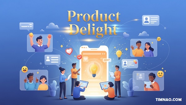
🌟 Product Delight That Truly Wows: The Ultimate Beginner’s Playbook 🎉
Product delight is the secret sauce that transforms a good product into a favorite, blending emotional design with a smooth customer experience so people feel seen, supported, and even a little surprised. If you’re new to building products, this guide walks you from zero to confident with practical steps, modern examples, and easy habits that fit real-world teams. We’ll move beyond buzzwords into actions you can run this week—no expensive tools or giant teams required.
This article expands on a simple, four-step approach to designing for delight (find motivators → frame opportunities → design & categorize solutions → validate & measure) and turns it into a beginner-friendly playbook you can apply in any product.
Table of Contents
- 😃 Start Here: What “Product Delight” Really Means
- 🧭 A Simple Model for Product Delight (Beginner Blueprint)
- 👂 Understand People First: Research Moves That Work
- 💡 From Insights to Opportunities: Turn Feelings into Features
- 🎨 17 Design Tactics That Create Product Delight
- 🧪 Hands-On Examples Beginners Can Learn From
- 📏 Measure What Matters (Without Overthinking It)
- 🗺️ Prioritize Delight Without Derailing the Roadmap
- 🙅♀️ Common Traps to Avoid (And What to Do Instead)
- 🤝 Make Delight a Team Habit
- 🧰 Starter Toolkit: Templates You Can Copy Today
- 🚀 Your First 30 Days: A Beginner Roadmap
- 🙋 FAQs: Beginner Questions About Product Delight Answered
- ✅ Key Lessons & Takeaways
😃 Start Here: What “Product Delight” Really Means
If you’ve ever smiled when an app remembered exactly where you left off or felt a small spark of joy when a website just worked without hassle, you’ve experienced product delight.
It’s that subtle, satisfying moment when a product not only does what it should — it goes beyond your expectations. It feels almost personal, like it was designed with you in mind.
What Product Delight Is (and Isn’t)
Let’s clear one thing up first: product delight isn’t about adding flashy animations or over-the-top gimmicks. It’s not confetti everywhere or a pop-up saying “You’re awesome!” for no reason.
Delight happens when design, functionality, and empathy come together to make users think, “Wow, that was easier than I expected.”
It’s what turns ordinary interactions into experiences worth remembering. A delightful product is one that quietly removes obstacles, anticipates needs, and rewards people for simply showing up.
Think about:
- Apple’s setup flow, where devices connect seamlessly with a soft “ding.”
- Duolingo’s friendly owl, who cheers you on instead of guilt-tripping you.
- Spotify’s auto-playlist, curating songs you didn’t know you needed.
Each of these moments seems small, yet they trigger an emotional response — trust, excitement, or gratitude. That’s delight in action.
Why Product Delight Matters More Than You Think
Many beginners believe delight is “nice to have.” In reality, it’s a retention engine. Users who feel good about a product stay longer, recommend it more, and forgive small mistakes.
When people emotionally connect to an experience, they become advocates instead of customers.
In a saturated market, functionality isn’t enough. Everyone can copy features. What’s hard to copy is how a product makes users feel. That emotional edge is your unfair advantage.
A 2023 Gartner study found that customers with an emotional connection are 3× more likely to repurchase and 4× more likely to recommend a brand.
Delight builds that connection — not through manipulation, but through genuine, thoughtful experiences.
The Three Layers of Delight
To make delight actionable, it helps to think of it in three layers:
- Surface Delight: Small, sensory cues that make interfaces feel alive — a satisfying click, a friendly message, a micro-animation that signals success.
- Functional Delight: When something works better than expected — a form autofills, a step disappears, a task completes faster.
- Emotional Delight: The deepest layer. It’s the moment users feel understood, respected, or empowered. That’s what turns use into loyalty.
Example
Imagine you’re designing a budgeting app:
- Surface Delight: Fun confetti when you hit a savings goal.
- Functional Delight: Automatic categorization of expenses.
- Emotional Delight: Encouraging messages when users slip up — focusing on progress, not guilt.
That last one makes users feel good about themselves, not just about your app.
The Core Rule: Delight Is Earned, Not Added
Delight is the outcome of clarity and care, not decoration. If your product still confuses users or makes them wait too long, adding emojis and cute copy won’t help.
Start with removing frustration. A product that simply “doesn’t get in my way” is already halfway to delightful.
Quick Checklist for Beginners
Before you think of delight features, ask:
- Does my product already solve the basic job reliably?
- Is there unnecessary effort or confusion in the main flow?
- Are there emotional “valleys” where users feel lost or anxious?
- Can I add a small moment of surprise or recognition where it feels natural?
If you can answer “yes” to at least two, you’re ready to move toward delight design.
The Emotion Equation
Every product experience can be summarized as:
Delight = Ease + Emotion – Effort
If your product is easy to use and makes people feel good, while demanding less effort, you create delight almost automatically.
For example, when Google Photos automatically backs up your images and builds highlight reels of family moments, users feel both relief (no lost data) and joy (reliving memories). The emotional layer compounds the utility.
Common Myths About Product Delight
- “Delight is expensive.”
It’s not. Most delightful moments are micro-improvements: smarter defaults, faster loading, friendlier wording. - “Delight is just design’s job.”
Wrong. Engineering, support, marketing — everyone contributes to the user’s journey. - “Delight is optional.”
In 2025, it’s survival. Users expect frictionless experiences by default.
From Satisfaction to Delight to Love
You can think of the user journey as three emotional milestones:
- Satisfaction: “It works.”
- Delight: “That was better than expected.”
- Love: “I can’t imagine using anything else.”
Delight is the bridge between satisfaction and love. It’s where loyalty starts.
So, before diving into frameworks and tools, remember: delight begins with empathy. When you truly understand what frustrates or motivates people, you can create magic in the ordinary.
🧭 A Simple Model for Product Delight (Beginner Blueprint)
Now that you understand what delight feels like, let’s turn it into a repeatable process.
You don’t need a huge design team or complex systems to start — just a framework that guides your thinking.
Here’s a simple, four-step blueprint for beginners.
It’s flexible enough for startups, personal projects, or small teams.
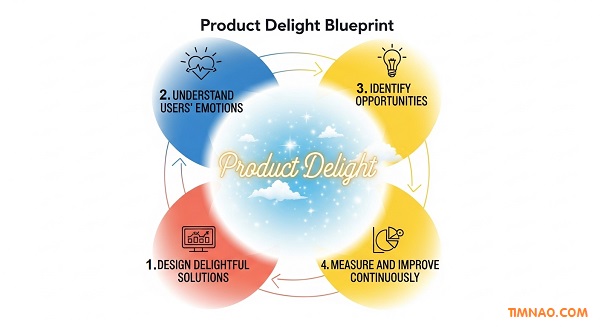
Step 1 – Find What Motivates Your Users
Every delightful product begins with empathy. You can’t surprise or help someone if you don’t know what drives them.
Functional Motivators
These are the practical jobs users want done. For instance:
- Sending an invoice quickly
- Booking a ride safely
- Organizing photos efficiently
Emotional Motivators
These are the feelings behind the job.
- A freelancer doesn’t just want to send invoices — they want to feel professional.
- A commuter doesn’t just need a ride — they want to feel safe and in control.
- A parent doesn’t just back up photos — they want to preserve memories.
When you uncover both, you design with depth.
Use short interviews, support chats, or quick polls to find patterns in emotion words: frustrated, relieved, confident, proud.
Beginner Exercise
Take your product (or idea) and list:
- 3 functional goals your user has
- 3 emotional states they want to feel
You’ll see overlaps that reveal where delight can live.
Step 2 – Frame Opportunities Using “How Might We” Questions
Once you know what motivates users, reframe those insights into open-ended opportunity statements.
The classic design-thinking format works beautifully here:
How might we [improve or ease this experience] for [user type] so they feel [desired emotion]?
Example
- “How might we simplify project setup for first-time users so they feel confident instead of overwhelmed?”
- “How might we make payment confirmation reassuring so users feel secure and informed?”
Framing this way invites creativity. It shifts your mindset from fixing problems to creating better emotions.
Pro Tip
If you’re stuck, flip your question:
“What frustrates users most during onboarding?” → “How might we remove that frustration so users feel successful in their first minute?”
Write 5–10 HMW questions. You’ll quickly see which ones spark ideas that blend function + feeling.
Step 3 – Design and Categorize Solutions
Now brainstorm freely — no filtering yet. Then sort your ideas by two simple axes: functional impact and emotional impact.
Create a quick 2×2 grid:
| Low Emotion | High Emotion | |
|---|---|---|
| Low Function | ignore / de-prioritize | “surprise & delight” moments |
| High Function | core improvements | gold zone delight (functional + emotional) |
Aim to spend most of your time in the gold zone — improvements that solve real pain while creating good feelings.
Examples
- High Function + High Emotion: Airbnb’s easy host-guest messaging with friendly tone.
- High Function + Low Emotion: Compressing image size for faster upload — useful but invisible.
- Low Function + High Emotion: A fun loading animation — nice, but limited value.
Label each idea and pick a few that balance impact vs effort.
Beginner Tip
Don’t chase perfection. Pick one small improvement per sprint or week that’s visible and emotionally meaningful.
Step 4 – Validate and Measure Your Delight
A common beginner mistake is assuming something delightful just because we like it. Always test whether users feel what you intend.
Quick Validation Checklist
- Watch 5 users interact with the prototype.
- Ask: “How did that feel?” after key steps.
- Note facial expressions and body language.
- Use short follow-ups like “This felt effortless/confusing/delightful” (1–5 scale).
If the response doesn’t match your goal emotion, iterate the tone, timing, or delivery.
Simple Metrics for Beginners
- Customer Effort Score (CES): “How easy was it to complete X?”
- Task Completion Rate: Are users succeeding faster?
- Sentiment Words: Count how often users say “easy,” “smooth,” or “fun” during testing.
You don’t need a full analytics stack. Even a few conversations can reveal whether your changes are hitting emotionally.
Visualize Your Blueprint
To keep the process visible for your team (or just yourself), draw this simple loop on a whiteboard:
1️⃣ Find Motivators
2️⃣ Frame Opportunities
3️⃣ Design Solutions
4️⃣ Validate & Measure
Add arrows in a circle. Delight isn’t a straight line — it’s a loop of learning and iteration.
Mini Case Study: Turning Pain into Delight
Let’s walk through a quick beginner-level example.
Scenario: A small online-course platform notices users drop off during checkout.
- Find Motivators
- Functional: enroll fast, no confusion about pricing.
- Emotional: feel confident, not scammed.
- Frame Opportunities
“How might we make payment feel transparent and reassuring?” - Design Solutions
- Show a summary of total cost + refund policy upfront.
- Add trust badges and clear next-step copy.
- Include a short note: “You can start learning immediately — no waiting.”
- Validate & Measure
- Before: 60 % completion rate.
- After changes: 78 %.
- Feedback keywords: “simple,” “clear,” “safe.”
No fancy graphics, no discounts — just thoughtful design tuned to emotion.
When to Use This Model
Use the beginner blueprint whenever you:
- Design a new feature or onboarding flow.
- Refresh an old product with low engagement.
- Need quick wins before a larger redesign.
It’s lightweight and keeps the focus where it should be: the human experience.
A Friendly Reminder for Beginners
Don’t expect instant perfection. Product delight grows gradually, through dozens of small, invisible acts of care.
You’ll know you’re on the right track when:
- Users stop asking the same “how do I do this?” questions.
- Support tickets drop.
- Reviews use emotional words like “love,” “easy,” “so helpful.”
Delight isn’t an event — it’s a habit. Keep iterating, keep listening, keep caring.
Next, we’ll explore how to truly understand people — diving deeper into research techniques and emotional mapping that power delightful experiences.
Stay curious, because the heart of every great product isn’t the code or design — it’s the feeling it creates.
👂 Understand People First: Research Moves That Work
If you want to create products people love, you need to start with people — not pixels, not code, not features. Every great product begins by deeply understanding what users care about, what frustrates them, and what emotions they experience along the way.
The good news? You don’t need to be a research expert to get this right. Even beginners can uncover powerful insights with the right mindset and a few simple techniques. Let’s explore how to start learning from users — the human way.
Why Understanding People Comes Before Design
A common beginner mistake is rushing into solutions. You get an idea, sketch a feature, and start building immediately. But without context, you’re designing in the dark.
Great design isn’t about guessing what users want. It’s about discovering what they actually need — and how they feel while using your product.
Think about this: people rarely use products just to finish a task. They use them to change how they feel about themselves.
- They use Notion to feel organized and capable.
- They use Duolingo to feel smart and consistent.
- They use Canva to feel creative and confident.
When you understand these emotional layers, you move beyond solving problems — you start shaping experiences.
Start with Curiosity, Not Confirmation
Most beginners go into research with answers already in mind. They ask questions like:
“Do you like this design?”
“Would you use this feature?”
But those questions trap users into polite agreement. What you really need is stories, not yes/no answers.
Instead, ask questions that make users describe real experiences.
Try These Instead
- “Tell me about the last time you tried to [do the task your product helps with]. What happened?”
- “What was the hardest or most confusing part?”
- “What made you feel frustrated — or pleasantly surprised?”
- “How did you feel when you finished (or gave up)?”
These prompts reveal what people value and struggle with.
Listen Like a Detective
Good research isn’t about collecting feedback — it’s about finding clues.
When users talk, don’t just note what they say. Pay attention to:
- Tone: Do they sound excited, annoyed, tired, proud?
- Pauses: Where do they hesitate or skip over details?
- Repetition: What do they keep mentioning unprompted?
The goal is to identify emotionally loaded moments — those peaks and valleys in their story where feelings are strongest. Those are your opportunities for delight.
Example
If someone says, “I finally figured out how to export it — it only took me 10 minutes,” they’re not complimenting your product. They’re describing frustration disguised as relief.
Every “finally” is a red flag. Every “I love how easy this part was” is a green flag.
Make Emotions Visible with an Empathy Map
An empathy map is a simple visual tool that helps you organize what users say and feel. It’s divided into four quadrants:
| Quadrant | Focus | Example |
|---|---|---|
| Says | Direct quotes | “I wish I could save without losing my work.” |
| Thinks | Unspoken beliefs or worries | “This app might crash again.” |
| Does | Observable actions | Repeatedly refreshes the page |
| Feels | Emotional state | Frustrated, anxious, impatient |
Start by summarizing notes from 5–10 users. Look for patterns: what frustrations repeat? What joys stand out?
This gives you a living snapshot of your user’s inner world — and it’s gold for deciding where to improve.
Map Emotional Highs and Lows
Go one step further with an emotional journey map.
List out the major steps users take in your flow (like “sign up,” “onboard,” “complete first task”). Then, for each step, plot their emotional state on a simple curve — from frustration to joy.
You’ll instantly see where people struggle or get stuck. Those are your valleys — prime areas to fix friction. And your peaks? That’s where you can amplify delight.
Quick Example
Imagine a food delivery app:
| Step | Emotion | Opportunity |
|---|---|---|
| Browse restaurants | Curious 😊 | Recommend popular local meals |
| Place order | Nervous 😟 | Show delivery time clearly |
| Wait for delivery | Impatient 😩 | Add live map + progress bar |
| Receive food | Happy 😍 | Send thank-you + coupon |
By visualizing emotions, you can design interventions that directly target how users feel, not just what they do.
Use the “Five Whys” Technique
When users mention a problem, don’t stop at the first answer. Keep digging with gentle curiosity.
“I stopped using it.”
— Why?
“It took too long.”
— Why?
“Because I had to re-enter my info.”
— Why?
“I wasn’t sure it saved from last time.”
— Why?
“Because there’s no confirmation screen.”
There’s your insight: not “speed,” but trust.
Understanding the “why behind the why” transforms feedback into actionable ideas.
Record, Reflect, and Summarize
After every interview, jot down:
- 3 key quotes that capture emotion
- 2 surprising discoveries
- 1 frustration you can fix immediately
This habit trains your brain to notice human signals rather than surface-level complaints.
Beginner-Friendly Tools for Research
You don’t need expensive software. These free or low-cost tools can help you get started:
- Google Forms – quick surveys for broad input.
- Notion – organize quotes, emotions, and findings.
- Miro – create empathy or journey maps visually.
- Otter.ai – transcribe interviews automatically.
- Zoom or Loom – record user sessions for playback.
The Mindset That Makes It Work
Research isn’t about asking the right questions — it’s about creating the right environment.
Users open up when they feel safe and heard. So:
- Don’t interrupt.
- Don’t defend your product.
- Listen to understand, not to reply.
When you genuinely care, people sense it. And that authenticity fuels the kind of insights no AI or data dashboard can replace.
💡 From Insights to Opportunities: Turn Feelings into Features
Once you’ve gathered insights, it’s time to transform them into actionable ideas. This is where raw empathy turns into design direction — where feelings become features.
The transition from research to action often trips beginners up. You might collect pages of quotes and maps but still feel unsure how to turn that into something real. Don’t worry — we’ll walk through it step-by-step.
Step 1 – Organize and Prioritize Your Insights
Start by sorting all your notes into simple categories:
- Friction Points – Where users struggle or get frustrated.
- Emotional Peaks – Where users express joy or relief.
- Unmet Needs – Tasks or feelings users wanted but didn’t get.
Then, group similar findings together. For example:
- “Hard to find the save button,” “Didn’t know if it saved,” “Lost my progress” → Unclear saving feedback.
- “Loved how quick setup was,” “Onboarding was smooth” → Speed satisfaction.
You’ve just created themes — patterns that point toward opportunities.
Step 2 – Write “Insight Statements”
An insight statement captures the truth you’ve discovered, written clearly and emotionally.
Structure it like this:
“Users feel [emotion] when [situation] because [underlying cause].”
Examples
- “New users feel anxious when signing up because they’re unsure what happens with their data.”
- “Frequent users feel proud when they finish a task because they can see measurable progress.”
- “Busy professionals feel frustrated when they have to redo steps because autosave doesn’t work reliably.”
Each insight helps you decide what kind of emotional change your product should create.
Step 3 – Translate Insights into “How Might We” (HMW) Questions
Now, turn each insight into an opportunity for action.
“How might we make sign-up feel more trustworthy and transparent?”
“How might we celebrate user progress more visibly?”
“How might we make autosave effortless and reliable?”
These open questions guide brainstorming without locking you into one solution.
Quick Tip
Good HMW questions balance specificity and openness.
Too narrow = limits creativity.
Too broad = no direction.
Aim for questions that inspire multiple approaches while keeping the emotional goal clear.
Step 4 – Rank Opportunities by Impact
You’ll probably end up with a dozen “How might we…” questions. To avoid overwhelm, prioritize using a simple Impact vs. Effort grid:
| Impact | Effort | Example |
|---|---|---|
| High | Low | Simplify a confusing step |
| High | High | Redesign onboarding flow |
| Low | Low | Add friendly microcopy |
| Low | High | Add AR feature nobody asked for |
Start with high-impact, low-effort ideas. They’re your quick wins — the fastest way to inject delight into your product.
Step 5 – Connect Emotions to Functionality
Every feature should address both a functional and an emotional need.
Ask yourself two questions for each idea:
- What problem does this solve?
- How should it make the user feel?
Example
Feature idea: “Show clear progress bar during onboarding.”
- Functional goal: Reduce uncertainty about where users are.
- Emotional goal: Help users feel calm and in control.
When functionality and emotion align, the result is powerful and memorable.
Step 6 – Visualize the Opportunity Landscape
For clarity, create a visual map that connects emotions → insights → opportunities → ideas.
Example:
| Emotion | Insight | Opportunity | Idea |
|---|---|---|---|
| Anxious | Users fear losing data | How might we make saving feel reliable? | Add autosave + confirmation toast |
| Proud | Users love finishing tasks | How might we celebrate success? | Add milestone badges |
| Confused | Users struggle during setup | How might we reduce cognitive load? | Provide checklist onboarding |
This visual makes it easy for everyone — from designers to developers — to see the emotional intent behind every feature.
Step 7 – Prototype Emotionally, Not Just Visually
When building prototypes, don’t just test layouts or buttons. Test feelings.
Instead of asking “Do you like this design?”, try:
- “How does this flow make you feel?”
- “At what point did you feel confused or confident?”
- “If this product were a person, what kind of personality would it have?”
These questions help you ensure that your design actually delivers the emotion you aimed for.
Step 8 – Involve the Whole Team
Product delight is a team sport. Bring your findings and maps into team discussions:
- Share 2–3 short user clips during meetings.
- Pin empathy maps to your workspace.
- Use one user quote to kick off brainstorms.
When everyone understands the “why” behind design decisions, they start contributing better ideas.
Step 9 – Document and Revisit
Don’t let insights die in slides. Keep a living document — even a simple Notion page — that stores all your emotional insights and ideas. Revisit it every quarter to see which patterns have shifted.
User emotions evolve as products mature. What delights today might be expected tomorrow.
Step 10 – Keep It Real
Always remember: real people are messy, inconsistent, and unpredictable.
Don’t aim for perfection — aim for connection.
If users say, “I love how this makes me feel,” you’ve succeeded far beyond usability.
In the next part, we’ll dive into 17 practical design tactics that transform these insights into real, tangible product delight — techniques any beginner can use to create joyful experiences from day one.
🎨 17 Design Tactics That Create Product Delight
Now that you understand how to uncover user emotions and turn insights into opportunities, it’s time to get your hands dirty.
This section is your action list — a practical toolkit of 17 design tactics to spark delight without bloating your product or confusing users.
Each tactic is beginner-friendly, easy to implement, and backed by real-world examples from brands that excel at emotional design.
You don’t need to use all 17 right away — pick a few, experiment, and layer them gradually. Small touches done consistently beat one big surprise.
Let’s dive in.
1. Eliminate Friction Before Adding Flair
Nothing delights users more than a product that just works. Before adding fancy animations or clever copy, make sure the basics are bulletproof.
Try This
- Cut one unnecessary step in a key flow (like checkout or onboarding).
- Replace long forms with progressive disclosure — show fields only when needed.
- Use autofill, smart defaults, and remembered inputs to reduce effort.
Example: Stripe refined payment forms down to the essentials — clear fields, no confusion. The result? Users pay faster and feel less stressed.
Remember: delight doesn’t start with sparkles; it starts with ease.
2. Personalize with Care (Not Creepiness)
Personalization can turn “just another app” into “my app.” But when done wrong, it feels intrusive.
Delightful personalization focuses on helpfulness, not surveillance.
Try This
- Greet users by name after onboarding.
- Show progress based on their activity, not generic averages.
- Use “smart suggestions” powered by recent behavior (like Spotify’s “Because you listened to…”).
Example: Netflix’s recommendations feel personal but respectful — they help users decide faster without feeling watched.
Keep it warm, not weird.
3. Celebrate Small Wins
Humans are wired to crave progress. Recognizing small milestones creates motivation and joy — even in routine tasks.
Try This
- Add a confetti burst or sound when users complete a key task.
- Use badges, streaks, or completion bars to visualize growth.
- Celebrate effort, not perfection.
Example: Duolingo’s streak count keeps users coming back daily — not for the language itself, but for the sense of achievement.
When you make progress visible, you make success addictive (in a good way).
4. Anticipate Needs Before Users Ask
Delight happens when your product feels one step ahead — predicting what users need before they realize it themselves.
Try This
- Pre-fill forms with known data.
- Offer relevant next steps after task completion.
- Suggest time-saving shortcuts based on context.
Example: Google Maps learns your commute and proactively suggests faster routes — a small touch that feels like magic.
Anticipation shows empathy. It says, “We see you, we’ve got you.”
5. Infuse Personality into Your Brand Voice
A friendly tone builds connection. The right words can make technical tasks feel human and approachable.
Try This
- Replace robotic language (“Invalid input detected”) with conversational tone (“Oops — that doesn’t look right!”).
- Match tone to context — light and friendly in onboarding, calm and clear during errors.
- Maintain consistency across emails, app messages, and help docs.
Example: Slack’s playful loading messages (“Reticulating splines…”) make even waiting feel less painful.
Voice is part of your interface — design it with the same care as visuals.
6. Build Resilient Empty States
Empty screens aren’t blank spaces — they’re opportunities to educate, guide, and inspire.
A good empty state tells users what to do next and why it matters.
Try This
- Add a quick example or sample content.
- Provide a one-click “create” button or link.
- Include a short benefit message like “Start tracking your habits today!”
Example: Canva shows templates on new dashboards so beginners never face the terror of a blank canvas.
Empty states are the first impression of usability — treat them as carefully as your homepage.
7. Design Helpful Error States
Errors are emotional moments. Handle them poorly, and you break trust; handle them well, and you build confidence.
Try This
- Explain why something went wrong in plain language.
- Offer a recovery action (“Try again,” “Undo,” or “Contact support”).
- Use gentle visuals or humor when appropriate.
Example: Mailchimp’s 404 pages are playful but helpful — users smile, not sigh.
Good error states turn frustration into reassurance.
8. Prioritize Accessibility — It’s Delight for Everyone
Accessible design isn’t just ethical; it’s practical. When your product works for people with different abilities, it works better for everyone.
Try This
- Add sufficient color contrast and readable font sizes.
- Ensure navigation works with keyboard and screen readers.
- Provide alt text, captions, and clear focus indicators.
Example: Apple integrates accessibility at every level — from VoiceOver to adaptive shortcuts. The result? A smoother experience for all.
Accessibility isn’t a constraint — it’s a catalyst for delight.
9. Make Performance Invisible (and Magical)
Speed isn’t a feature you brag about — it’s one users feel.
Fast, seamless experiences create subconscious delight because they eliminate waiting and worry.
Try This
- Use skeleton screens instead of spinners to show progress.
- Optimize load times under two seconds for key actions.
- Prefetch assets for likely next screens.
Example: Instagram’s instant photo previews and offline caching make posting feel effortless — even with poor connectivity.
Fast equals trustworthy.
10. Simplify Authentication
Few things frustrate users more than clunky logins. Simplify the experience and you instantly gain goodwill.
Try This
- Support magic links, passkeys, or social logins.
- Allow passwordless sign-ins where safe.
- Keep error recovery easy — no forgotten-password nightmares.
Example: Notion’s “Continue with Google” option saves users time and keeps them in flow.
The easier it is to enter, the sooner delight can begin.
11. Use Micro-Interactions Thoughtfully
Micro-interactions — small animations or feedback cues — make a product feel alive. The secret is subtlety.
Try This
- Add gentle motion when users complete actions.
- Use animation to confirm success, not distract.
- Keep transitions under 300ms to maintain snappiness.
Example: The “heart” animation on Instagram when you double-tap a post feels rewarding but unobtrusive.
Motion should serve purpose, not ego.
12. Offer Context-Aware Defaults
Users love when products “just know” what they mean. Context-aware defaults reduce cognitive load — users feel understood.
Try This
- Preselect shipping addresses or recent options.
- Suggest preferred file formats based on prior uploads.
- Auto-detect timezone or language intelligently.
Example: Google Docs auto-saves and reopens the last document instantly. It feels seamless — like continuity magic.
Every smart guess adds to the feeling of effortlessness.
13. Visualize Progress Clearly
Progress bars, checklists, and milestones reduce anxiety by giving users a sense of control.
People like knowing where they are and what’s next.
Try This
- Show progress indicators during multi-step tasks.
- Include microcopy like “Step 2 of 3 — almost done!”
- Celebrate the final step with a simple “You did it!”
Example: Airbnb guides hosts through setup with visible progress markers — turning complex onboarding into achievable steps.
Transparency builds trust — and trust is delight’s foundation.
14. Reward Loyalty Authentically
Instead of generic points or discounts, reward users with experiences that feel personal and meaningful.
Try This
- Unlock small bonuses after milestones (e.g., early access to features).
- Send personalized thank-you messages or gifts.
- Share progress summaries like Spotify Wrapped or Year in Review.
Example: Starbucks’s tiered reward program turns everyday purchases into progress — people stay for the emotional payoff, not the caffeine.
Recognition is a powerful motivator.
15. Make Privacy Feel Empowering
Privacy shouldn’t feel like paperwork. When users sense transparency and control, they feel respected — a subtle but powerful form of delight.
Try This
- Use clear language about data use.
- Offer toggles for permissions instead of forced consent.
- Show benefits of data sharing (“We use your location to improve accuracy”).
Example: Apple leads by example, giving users simple choices and visual explanations for every permission.
Privacy builds trust — and trust drives love.
16. Design for Offline and Low Connectivity
Connectivity issues happen everywhere. Products that remain usable offline earn instant appreciation.
Try This
- Cache drafts or form entries automatically.
- Queue actions to sync later.
- Show clear indicators of offline mode.
Example: Google Drive lets users edit files offline and syncs automatically when connection returns — no panic, no loss.
Reliability is delight disguised as stability.
17. Turn Waiting Time into Value
Waiting moments — downloads, uploads, updates — are inevitable. But they don’t have to be boring.
Try This
- Use progress bars with accurate timing.
- Add educational or fun tidbits (“Did you know…?”).
- Show a preview or next-step suggestion during loading.
Example: The offline Chrome Dino Game turns a dead network moment into playful surprise — people now look forward to being offline.
Every delay can become an experience if handled creatively.
How to Apply These Tactics Strategically
It’s tempting to try everything at once, but true delight emerges from focus and consistency.
Step 1 – Choose Your “Delight Zones”
Identify 2–3 key user journeys where emotions run high — onboarding, checkout, or sharing. Focus your efforts there first.
Step 2 – Layer Gradually
Start with utility-based delights (like performance and clarity) before adding emotional ones (like animations or rewards).
Step 3 – Measure Small Wins
Use quick surveys (“This felt effortless”), observe behavior changes, and listen for emotion words like smooth, fast, fun, easy.
Over time, you’ll build a library of proven patterns that fit your audience.
Example: Turning a Boring Flow into a Delightful One
Imagine a simple expense tracker app. Here’s how to apply several tactics together:
- Simplify login with Google sign-in.
- Anticipate needs by suggesting expense categories.
- Show progress as the report generates.
- Add micro-interaction on save confirmation (a satisfying checkmark).
- Celebrate milestones when users complete their monthly budget.
None of these are expensive or complex, yet together they create an experience users describe as “easy and enjoyable.”
Delight is rarely one big thing — it’s the accumulation of thoughtful little things.
Beginner Mistakes to Avoid
- Overdecorating: Don’t confuse delight with glitter. Every flourish should serve purpose.
- Ignoring Context: Fun tone in billing screens or errors in medical apps can feel tone-deaf.
- Copying Blindly: What works for Slack might not suit your product’s tone or audience.
- Forgetting Consistency: A delightful animation loses meaning if it appears randomly.
When in doubt, ask: Does this make life easier, clearer, or more enjoyable for the user? If not, skip it.
A Simple Exercise to Get Started
Pick one flow — maybe your signup or checkout process. Walk through it as if you were a new user.
Ask yourself:
- Where do I hesitate?
- Where do I smile?
- Where do I feel “meh”?
Then choose 2–3 tactics from this list that could transform those “meh” moments into “ah, nice!” moments.
Commit to improving one per week. After a month, you’ll notice real change in user feedback and engagement.
The Bigger Picture: Delight Is a Team Sport
Designers create interfaces, but everyone creates experiences.
- Engineers make speed and reliability delightful.
- Product managers prioritize small wins that matter.
- Support teams inject humanity into help interactions.
When each role owns a piece of delight, users feel it everywhere.
In the next part, we’ll explore how to measure and sustain product delight over time — because delight isn’t a one-off trick, it’s a continuous habit that evolves with your users.
🧪 Hands-On Examples Beginners Can Learn From
Learning theory is great — but nothing beats seeing delight in action.
This section walks through real products that turned everyday interactions into emotional moments.
You’ll see what worked, why it mattered, and how you can recreate similar results without a massive budget.
1. Airbnb – Confidence Through Clarity
Airbnb’s success isn’t just about cheap stays.
It’s about trust and transparency.
When users explore listings, they instantly see photos, reviews, and cancellation terms.
Each element answers an emotional question: Can I trust this place? Will it look like the photos?
Beginner takeaway: Clarity creates calm.
Make every detail visible early — users relax when surprises disappear.
2. Canva – Creativity Without Intimidation
Before Canva, design felt exclusive.
Canva flipped the script by making graphic design feel easy and playful.
Drag-and-drop templates, built-in tutorials, and encouraging copy (“You got this!”) empower beginners to create confidently.
Even professionals appreciate the speed and simplicity.
Try this: Replace “advanced options” with “quick wins.”
The moment users succeed fast, delight begins.
3. Spotify – Predictive Delight
Spotify knows you better than you know yourself.
Its “Discover Weekly” playlist surprises users every Monday with songs they might love — and it’s eerily accurate.
Behind the algorithm lies empathy: people crave freshness without effort.
Spotify delivers exactly that, creating a sense of being understood.
What you can copy: Turn recurring tasks into automatic rewards.
Save users time while making them feel personally seen.
4. Notion – Flexibility That Feels Personal
Notion takes something boring — documentation — and makes it feel like self-expression.
Its tone, icons, and customization options transform a productivity tool into a creative canvas.
Users don’t just build pages; they build identity.
Every emoji, color, and template becomes part of their story.
Lesson: Give people small ways to personalize.
When they make it theirs, they’ll love it more.
5. Duolingo – Motivation as a Game
Duolingo turns the slow grind of learning a language into playful competition.
Streaks, rewards, and friendly reminders keep motivation alive.
But here’s the genius: the app mixes pressure and praise perfectly.
It nudges you without guilt, cheering you even after mistakes.
For beginners: Add progress feedback early.
Even tiny celebrations create emotional energy to continue.
6. Google Maps – Anticipation and Assurance
Few tools save time and stress like Google Maps.
It doesn’t just show directions — it anticipates worry.
From traffic warnings to rerouting suggestions, Maps reassures users they’re on track.
Real-time updates and smooth transitions turn potential panic into calm confidence.
Takeaway: Design for moments of uncertainty.
If your product can replace anxiety with assurance, you’ve won.
7. Mailchimp – Humor That Heals Stress
Email marketing can be dry.
Mailchimp injected humor and warmth into a traditionally robotic task.
Its mascot Freddie gives thumbs-ups, cracks jokes, and celebrates send-offs.
Those details soften high-stress moments — like hitting “Send to 100 000 people.”
Beginner idea: Add light personality to tense interactions.
A gentle smile (digital or literal) makes users exhale.
8. Zoom – Comfort in Digital Spaces
Zoom became essential during remote work, but one subtle feature stood out: “Touch Up My Appearance.”
It solved an emotional pain — video anxiety.
By improving self-image, Zoom made virtual presence less intimidating.
That’s emotional design in disguise.
Lesson: Sometimes delight hides in small confidence boosters.
Solve hidden fears, not just visible friction.
9. IKEA Place – Empowerment Through Visualization
IKEA Place uses AR so customers can preview furniture at home before buying.
It bridges imagination and reality — no tape measures, no doubt.
Shoppers feel empowered, not pressured.
They see, decide, and smile.
For your product: Let users preview outcomes.
Confidence breeds delight.
10. Headspace – Calm in Every Pixel
Headspace sells meditation, but what it really delivers is emotional safety.
From colors to voice tone, everything whispers relaxation.
Its animations feel soft, the copy feels kind, and onboarding feels like a gentle invitation, not a task.
Takeaway: Visual tone matters.
Your design language can evoke the emotion your product promises.
Why These Examples Work
Each of these products succeeds because they combine three principles:
- Ease — remove friction.
- Emotion — spark feeling.
- Empathy — understand the “why.”
Delight doesn’t require big budgets.
It requires noticing what makes people feel seen, safe, and satisfied.
📏 Measure What Matters (Without Overthinking It)
You can’t improve what you don’t measure — but measuring delight can feel fuzzy.
How do you quantify emotion without reducing it to numbers?
Here’s a simple approach that balances data and feeling.
Step 1 – Track Ease and Effort
Start with the Customer Effort Score (CES).
After a task, ask one question:
“How easy was it to complete this task?” (1 = hard, 5 = effortless)
Lower effort usually equals higher delight.
When things feel smooth, users relax and stay.
Pair it with task completion rates.
If users succeed more often and faster, you’re moving the right way.
Step 2 – Listen for Emotion Words
Numbers alone can’t tell the whole story.
Listen to how people describe your product.
Track keywords like easy, smooth, love, fun, fast, and frustrating.
Those emotional signals appear in reviews, support chats, and social posts.
Beginner Tip: Create a “sentiment dictionary” in a spreadsheet.
Tally how often each emotion word appears month by month.
Step 3 – Use Tiny Pulse Surveys
Instead of long questionnaires, sprinkle in micro-surveys at meaningful moments:
- After onboarding (“How was that experience?”)
- After purchase (“Did everything feel clear?”)
- After support chat (“Did you feel helped?”)
Keep them to one or two clicks.
The less effort users need to answer, the more honest the data.
Step 4 – Map Sentiment Over Time
Emotions fluctuate.
Someone might love your product today and feel frustrated next week.
Use trend charts to spot emotional swings.
If joy spikes after feature X but drops after update Y, investigate.
The goal isn’t perfection — it’s awareness.
Step 5 – Balance Quant and Qual
Hard data tells you what happened.
Stories tell you why.
Combine analytics (clicks, completion rates) with quotes or session recordings.
Even a few user voices make numbers meaningful.
Step 6 – Watch Retention and Referrals
Delightful products don’t need expensive ads.
Users bring friends.
Monitor repeat visits, referral codes, and word-of-mouth mentions.
These are emotional loyalty indicators hiding in plain sight.
Step 7 – Create a Delight Score (Your Way)
You can invent a simple internal metric.
Example:
Delight Score = (CES × NPS) – Support Tickets Per 100 Users
It’s not scientific — it’s directional.
Use it to start conversations, not to chase perfection.
Step 8 – Use Behavioral Clues
Look beyond surveys.
Watch how people behave.
- Do they linger after completing a task?
- Do they smile or nod in usability tests?
- Do they share screenshots or recommendations?
These subtle cues often reveal delight better than dashboards.
Step 9 – Celebrate Progress, Not Numbers
Measurement isn’t about judgment — it’s about learning.
Share small wins with your team: “Support tickets dropped 15 % after the new onboarding flow.”
When teams see the emotional impact behind data, they feel motivated to do more.
Step 10 – Avoid Over-Analysis
Beginners sometimes obsess over metrics until they forget humans.
Use data as a flashlight, not a microscope.
If you can sense that users are smiling, you’re probably on the right path.
🗺️ Prioritize Delight Without Derailing the Roadmap
Once you start seeing opportunities for delight everywhere, it’s tempting to do everything at once.
But not all delightful ideas fit your current goals.
Let’s learn how to integrate delight strategically without slowing delivery.
Step 1 – Classify Your Ideas
Split ideas into three buckets:
- Must-Haves — Core usability fixes or accessibility improvements.
- Should-Haves — Emotion-boosting enhancements that support key flows.
- Could-Haves — Small, low-effort surprises for later iterations.
This simple hierarchy helps you decide what delights now and what delights later.
Step 2 – Time-Box Your Experiments
Delight doesn’t have to delay deadlines.
Set small experiments that fit inside your normal sprint cycle.
Example: dedicate 5 % of every sprint to “Delight Tasks.”
They might be copy tweaks, animation refinements, or micro-interactions.
Over time, these small increments add up.
Step 3 – Tie Delight to KPIs
Speak the language of leadership.
Show how delight supports measurable goals — retention, conversion, support reduction.
When stakeholders see that delight drives results, they’ll back your ideas faster.
Step 4 – Prototype Before Production
Before investing weeks in development, create lightweight prototypes.
Use Figma or Maze to test micro-moments quickly.
Even 10 minutes of testing can save 10 days of rework.
Step 5 – Collaborate Across Teams
Don’t isolate delight within design.
Invite engineers, marketers, and support staff to co-create ideas.
Each discipline sees unique opportunities for emotion and ease.
Shared ownership builds momentum and reduces bottlenecks.
Step 6 – Schedule a Quarterly “Delight Audit”
Every few months, pause and ask:
- Which parts of our experience spark joy?
- Which parts still cause frustration?
Score each flow from 1 to 5 on “emotional smoothness.”
Then pick one low-score area to improve next quarter.
This keeps delight visible without constant context switching.
Step 7 – Say No Gracefully
Not every idea fits.
Learn to say no with respect and reason.
“That’s a fun idea, but it doesn’t align with our current goal.
Let’s revisit it during our next delight audit.”
Preserve creativity while protecting focus.
Step 8 – Document Small Wins
Keep a running “Delight Log.”
Each time you ship a tiny improvement, record the impact.
Over time, you’ll build a case study library that proves how small details add big value.
Step 9 – Balance Novelty and Consistency
Beginners sometimes over-experiment.
Remember that consistency is comforting.
If everything changes constantly, users lose trust.
Evolve slowly, not chaotically.
Step 10 – Keep Empathy as the Compass
Roadmaps shift, deadlines change, but empathy never expires.
Whenever you’re uncertain what to prioritize, ask:
“Will this make users feel more understood and supported?”
If yes, it’s worth the effort.
Prioritizing delight isn’t about perfection or polish.
It’s about weaving humanity into every release.
When you balance empathy with execution, you turn ordinary roadmaps into meaningful journeys — for you and your users.
🙅♀️ Common Traps to Avoid (And What to Do Instead)
Building delightful products can be fun — but it’s also easy to get lost.
Many beginners mistake “delight” for decoration or think every interaction needs to sparkle.
The truth? Overdoing it often ruins the very experience you’re trying to enhance.
Let’s walk through the most common pitfalls that derail delight — and how to sidestep each one gracefully.
1. Confusing Delight with Distraction
Delight is about clarity and emotion, not fireworks.
Some teams pile on animations, emojis, or quirky messages hoping to feel “fun.”
But too much can backfire, slowing users down and breaking flow.
What to do instead:
Keep every detail purposeful.
If an animation doesn’t guide attention or communicate state change, remove it.
Use subtle transitions and micro-feedback — like color changes or motion cues — that enhance comprehension, not noise.
Remember: simplicity delights deeper than spectacle.
2. Focusing on Features Instead of Feelings
Beginners often chase feature parity with competitors.
They forget that users don’t love products for what they do, but for how they feel using them.
You might add “smart filters” or “AI suggestions,” but if users still feel lost, nothing else matters.
What to do instead:
Shift your success metric from feature shipped to emotion delivered.
Ask after every release: “Did this make users feel more confident, capable, or cared for?”
Delight isn’t a checkbox — it’s an emotional outcome.
3. Ignoring Context
What delights one audience might annoy another.
A playful tone that feels perfect for a gaming app could seem childish in a finance tool.
What to do instead:
Design with context awareness.
Always match your product’s tone, timing, and emotional energy to your audience’s mindset.
If your users are anxious or rushed, prioritize reassurance over humor.
Delight should amplify purpose, not distract from it.
4. Adding Delight Too Early
When your core experience still has friction, adding “fun” is like putting frosting on raw dough.
If people can’t even log in easily, no confetti will save you.
What to do instead:
Fix the fundamentals first.
Make the main flow intuitive, fast, and reliable.
Once users can move effortlessly, then introduce moments of joy.
In short: earn delight by earning trust first.
5. Designing for Yourself, Not for Users
You might love a design idea — but if it doesn’t fit your audience, it’s vanity, not value.
Designers and founders often fall into this trap, creating clever moments they personally enjoy.
Unfortunately, delight built for you might alienate them.
What to do instead:
Revisit real user insights regularly.
Test small changes with real people, not your team.
Let users tell you what feels natural — they’re the ultimate judges of delight.
6. Forgetting the Power of Silence
Sometimes, the most delightful thing is what doesn’t happen.
No extra pop-ups. No irrelevant emails. No interruptions mid-task.
Beginners sometimes mistake delight for constant engagement.
In truth, restraint can be deeply satisfying.
What to do instead:
Audit your user journey for interruptions or alerts.
Remove half of them.
Then test again — you’ll likely see engagement increase, not drop.
Less noise equals more peace.
7. Inconsistency Across Touchpoints
Imagine your product interface feels friendly, but your support emails sound cold.
Or your app is playful, but your website feels corporate.
Users experience your brand as one conversation — inconsistency breaks trust.
What to do instead:
Create a tone and experience guide that defines your emotional “signature.”
Align visuals, words, and behaviors across every channel.
When everything feels coherent, delight compounds naturally.
8. Treating Delight as a One-Time Project
Delight isn’t a campaign; it’s a continuous practice.
Too many teams add “delight” during one redesign and forget it afterward.
What to do instead:
Make it a recurring ritual.
Review feedback every few months and identify new micro-opportunities.
User expectations evolve — so should your experience.
Long-term delight grows from consistency, not bursts of innovation.
9. Copying Competitors Blindly
Seeing what others do can inspire you, but mimicry kills authenticity.
Your users can sense when something feels borrowed or out of place.
What to do instead:
Study what works elsewhere, but translate it through your brand’s personality.
Ask, “How would we express this emotion?” not “How can we copy it?”
The goal isn’t to be another Spotify or Duolingo — it’s to be your own version of delightful.
10. Measuring Too Much or Too Little
Some teams drown in metrics, tracking everything but learning nothing.
Others rely only on gut feeling. Both extremes stunt progress.
What to do instead:
Pick 3–4 key signals that matter most to your product.
For most beginners, those are ease (CES), satisfaction (NPS), and emotional tone (sentiment).
Keep measurement simple, consistent, and actionable.
Data should guide empathy, not replace it.
11. Overcomplicating Delight for Small Teams
You don’t need a “delight department” or expensive UX tools.
Even small teams can deliver magic.
What to do instead:
Start with one flow.
Use a shared doc or whiteboard to note user emotions at each step.
Fix one frustration per week — and celebrate visible progress.
Consistency beats complexity every time.
12. Losing Sight of Purpose
The biggest trap? Forgetting why you’re creating delight in the first place.
It’s not about applause or aesthetics — it’s about helping humans feel capable and cared for.
What to do instead:
Anchor every design decision in purpose.
If it doesn’t serve the user’s success or emotional clarity, cut it.
Purpose-driven delight is timeless.
🤝 Make Delight a Team Habit
Delight shouldn’t live only in the design corner.
It thrives when everyone — from engineers to customer support — shares the same goal: to make users’ days a little brighter.
Let’s explore how to build that culture, one habit at a time.
Step 1 – Define What “Delight” Means for You
Every company has its own flavor of delight.
For some, it’s friendliness.
For others, it’s reliability or surprise.
If you don’t define it, everyone imagines something different.
Try this:
In your next team meeting, ask:
“When have we personally felt delighted by a product — and why?”
Gather those stories.
You’ll discover shared emotional values that can shape your brand’s definition of delight.
Step 2 – Add Delight to Decision Frameworks
When prioritizing features, include a “Delight Impact” column.
Rate each idea on how strongly it can improve user emotion.
It doesn’t need to dominate decisions — just stay visible.
Once delight enters your vocabulary, it starts guiding choices naturally.
Step 3 – Empower Every Role to Contribute
Delight isn’t limited to design or product teams.
- Engineers create delight through performance and reliability.
- Marketers build emotional resonance through tone and visuals.
- Support agents turn frustration into loyalty with empathy and kindness.
Encourage everyone to share small wins or user compliments.
That collective ownership builds momentum.
Step 4 – Share Real User Stories Regularly
Data is useful, but stories drive hearts.
Once a month, share a user story that captures how your product helped someone.
Keep it human and emotional.
Hearing “This saved me hours every week” inspires far more than charts ever could.
Stories remind teams that they’re not building for metrics — they’re building for people.
Step 5 – Celebrate Internal Acts of Empathy
If a teammate goes above and beyond for a user, spotlight it.
Recognition encourages others to do the same.
Create a “Delight of the Month” award.
Reward behaviors that embody empathy, creativity, or thoughtfulness — not just results.
Small rituals like this make empathy visible.
Step 6 – Make Feedback Loops Fun
Collecting user feedback shouldn’t feel like a chore.
Gamify it.
Run mini “empathy challenges” — each team member must talk to one user per week.
Share learnings on Fridays.
Keep it light, curious, and conversational.
Soon, feedback becomes second nature.
Step 7 – Build Delight Into Reviews and Retrospectives
After every release or sprint, ask:
- What delighted our users this cycle?
- What friction still remains?
Add a “Delight Lens” to retrospectives.
Even one small insight each time builds cumulative improvement.
Step 8 – Document Delight Patterns
Keep a simple, visual “Delight Playbook.”
Record examples of successful copy, interactions, and moments that worked well.
This living library saves future teams from reinventing the wheel — and keeps your emotional design language consistent.
Step 9 – Pair Data with Empathy
Encourage teams to review analytics and listen to real users side by side.
When designers and engineers see the faces behind the numbers, priorities shift.
Balance dashboards with human stories.
That’s how you protect heart in a metrics-driven culture.
Step 10 – Make Delight Part of Your Identity
Finally, embed delight into your company DNA.
Mention it in onboarding, celebrate it in meetings, and use it as a hiring filter.
Ask candidates:
“Tell us about a time you made something delightful for someone.”
People who think this way will naturally extend it to everything they build.
Why Team Habits Matter
Delight doesn’t come from one department or one campaign.
It emerges from consistent behavior — a mindset that asks, “How can we make this moment a little better?”
When teams internalize that question, delight becomes effortless and continuous.
The Ripple Effect
When your product delights users, they talk about it.
When your team delights each other, they stay inspired.
That energy flows outward — from meetings to code commits to the final click.
Delight isn’t an outcome anymore.
It becomes the culture itself.
🧰 Starter Toolkit: Templates You Can Copy Today
By now, you know what product delight means, how to uncover user emotions, and how to turn insights into tangible experiences.
But theory only gets you halfway. What truly helps beginners move forward are ready-made templates — simple, reusable structures that make the creative process faster, clearer, and more consistent.
This section gives you exactly that: plug-and-play templates you can copy into your favorite tool (like Notion, Miro, or FigJam) and start using today.
Each one is practical, minimal, and beginner-proof — no fancy UX degree needed.
Let’s build your personal delight toolkit.
🗂️ Template 1: The Product Delight Canvas
Think of this as your “one-page overview” for designing delightful experiences.
It helps you connect emotions, functionality, and user value in a single view — perfect for brainstorming or sprint planning.
How to use it:
Draw a 2×2 grid or copy this layout into a digital whiteboard.
| Section | Description | Example |
|---|---|---|
| User Goal | What is the user trying to achieve? | “Book a flight quickly” |
| Emotional Goal | How should the user feel while doing it? | “Confident and stress-free” |
| Current Friction | What frustrates or confuses them today? | “Hidden fees, too many steps” |
| Opportunity for Delight | How could you make it smoother or more rewarding? | “Transparent pricing + one-click booking confirmation” |
Beginner Tip:
Use emojis or quick sketches to make it visual — emotion is easier to design when you can see it.
Once you fill this out for your core flows (onboarding, checkout, saving, sharing), you’ll instantly spot where your biggest “delight gaps” live.
💭 Template 2: The “How Might We” Brainstorm Sheet
The HMW framework is one of the fastest ways to turn user frustrations into creative opportunities.
Copy this format:
| Step | Prompt | Example |
|---|---|---|
| 1. Pain Point | What’s frustrating users right now? | “Users forget passwords often.” |
| 2. Why It Matters | What emotional impact does that create? | “They feel locked out and anxious.” |
| 3. Opportunity | What’s the opposite feeling you want to create? | “Ease and confidence.” |
| 4. Question | How might we create that feeling? | “How might we make login feel effortless?” |
| 5. Ideas | List 3–5 quick solutions. | “Add magic link, face ID, or one-tap login.” |
Keep this template in your project workspace.
Every time you do user research or receive feedback, turn insights into HMW statements — they’re creative fuel for delight design sessions.
🎯 Template 3: The Delight Prioritization Matrix
Once you have dozens of ideas, you’ll need a simple way to pick what to build first.
Use this Impact vs Effort Matrix to prioritize.
| Impact | Effort | Example |
|---|---|---|
| High Impact + Low Effort | Quick wins — do these first | “Add progress bar to onboarding” |
| High Impact + High Effort | Plan for later sprints | “Redesign dashboard UX” |
| Low Impact + Low Effort | Optional experiments | “Add friendly 404 copy” |
| Low Impact + High Effort | Skip or rethink | “Add AI chatbot nobody needs” |
Draw this on a whiteboard and place your ideas as sticky notes.
This visual clarity keeps your team aligned and ensures you don’t derail your roadmap chasing “shiny” ideas.
🧭 Template 4: Emotional Journey Map
Emotions drive behavior.
This template helps you trace how users feel at each stage of your product experience — from entry to exit.
Structure it like this:
| Step | User Action | Emotion | Opportunity |
|---|---|---|---|
| Sign Up | Fills out form | 😬 Frustrated | Simplify with autofill or single sign-on |
| Onboarding | Tries first feature | 😕 Curious but lost | Add tooltips or success pop-up |
| Daily Use | Completes task | 😊 Confident | Add micro-rewards or celebration animation |
| Support | Needs help | 😔 Anxious | Add instant chat or empathetic tone |
You can use this as a recurring team exercise.
Whenever something changes — a new feature, pricing update, or workflow tweak — revisit the journey map to see if emotions still align with your brand’s promise.
📣 Template 5: Delight Feedback Tracker
Data is powerful only when it’s simple.
This template helps you collect and categorize emotional feedback quickly, without drowning in spreadsheets.
| Source | Quote / Observation | Emotion | Tag | Action Taken |
|---|---|---|---|---|
| Support Ticket | “Love how fast the checkout was!” | 😊 Joy | Speed | Keep optimizing load time |
| “Can’t find my saved drafts.” | 😩 Frustration | Clarity | Fix UX for saved items | |
| User Interview | “Felt so proud finishing onboarding.” | 😍 Pride | Motivation | Reinforce celebration moments |
Color-code emotions (green = positive, red = negative).
Every few weeks, review patterns with your team.
You’ll see emotional trends emerge faster than any dashboard can show.
🪄 Template 6: Micro-Delight Checklist
Before launching a feature, run through this quick pre-flight checklist.
It’s like a “delight sanity check” — ensuring you didn’t forget the small things that make a big difference.
Copy this into your Notion or product QA checklist:
✅ Is the first interaction effortless?
✅ Does the copy feel friendly and human?
✅ Are success messages clear and encouraging?
✅ Are error messages calm and helpful?
✅ Are animations short, purposeful, and responsive?
✅ Is loading time under two seconds?
✅ Is tone consistent with brand personality?
✅ Are users rewarded, even subtly, for completing key tasks?
✅ Does this feature make users feel more capable or cared for?
If you can check at least seven of these boxes, you’re likely delivering genuine delight.
📈 Template 7: Delight Measurement Dashboard (Beginner Version)
You don’t need complex analytics tools to measure delight — a simple Notion or Google Sheet works beautifully.
Here’s a simple setup:
| Metric | Description | How to Collect | Frequency | Example Goal |
|---|---|---|---|---|
| Customer Effort Score (CES) | Measures ease of task | 1–5 post-task rating | Monthly | ≥ 4.5 |
| Net Promoter Score (NPS) | Measures loyalty | “Would you recommend us?” | Quarterly | ≥ +40 |
| Sentiment Words | Positive/negative mentions | Manual tagging from feedback | Weekly | 80% positive |
| Support Tickets | Problem volume | Auto-count | Monthly | ↓ by 20% |
Add a simple color system (green/yellow/red) to see at a glance how your product “feels” over time.
It’s low-tech, fast, and keeps emotional performance visible.
✏️ Template 8: Copywriting for Delight
Words are design too.
The right tone transforms confusion into comfort.
Here’s a before/after template for writing delightful copy:
| Scenario | Boring / Robotic | Delightful & Human |
|---|---|---|
| Success | “Operation completed successfully.” | “All done — that was smooth!” |
| Error | “Invalid credentials.” | “Hmm, that password didn’t match — try again?” |
| Onboarding | “Create your account to proceed.” | “Let’s get you set up — it only takes a minute.” |
| Loading | “Loading data…” | “Hold tight — we’re fetching something good.” |
| Empty State | “No data found.” | “Looks quiet here. Start by adding your first note!” |
Beginner reminder: use empathy, not cleverness.
Delightful copy isn’t about being funny — it’s about sounding human and kind.
🧩 Template 9: Delight Sprint Board
A Delight Sprint is a short, focused design sprint aimed at improving one emotional pain point.
This board template helps you organize the process in just five columns:
| Column | Description | Example Card |
|---|---|---|
| 🎯 Pain Point | The frustration or emotion to fix | “Users feel anxious during checkout” |
| 💡 Ideas | Brainstormed fixes | “Show total price early” |
| 🧪 Experiments | Prototypes or small tests | “A/B test clear summary step” |
| 📊 Results | Outcome metrics | “↑ 18% conversion, ↓ 22% support tickets” |
| ❤️ Learnings | Key takeaways | “Transparency builds trust — keep it!” |
Run one Delight Sprint every 4–6 weeks.
Over time, these small cycles create cumulative emotional improvement without heavy rework.
🧱 Template 10: The Delight Audit Framework
Every few months, do a mini self-audit.
This helps ensure delight remains consistent as your product grows.
Here’s a quick scoring system:
| Area | Questions to Ask | Score (1–5) | Action |
|---|---|---|---|
| Ease | Can users finish core tasks without confusion? | ||
| Emotion | Do they feel capable, cared for, and confident? | ||
| Consistency | Does the tone, style, and behavior feel unified? | ||
| Performance | Are loading times and interactions fast enough? | ||
| Support | Is help accessible and empathetic? |
Tally the total score.
Anything below 20 means you’ve got a great opportunity to sprinkle more care into the details.
🧰 Bonus: Delight Toolkit Starter Pack (Free Tools You Already Have)
You don’t need premium subscriptions to create delightful experiences.
Here’s how to start using common tools you likely already know:
- Figma → Build simple prototypes for micro-interactions.
- Notion → Centralize user insights, journey maps, and delight logs.
- Canva → Create quick visuals and emotion boards.
- Loom → Record user tests or share design intentions.
- Google Sheets → Track delight metrics simply.
- Miro → Brainstorm emotion maps with your team visually.
The best toolkit is the one you’ll actually use.
Start small, stay consistent, and iterate weekly.
💬 How to Integrate These Templates Into Your Workflow
- Pick one focus area — onboarding, checkout, or support.
- Use the Delight Canvas to identify pain and emotion.
- Generate 3–5 HMW questions.
- Prioritize with the Impact–Effort Matrix.
- Prototype using the Delight Sprint Board.
- Track emotional progress with the Measurement Dashboard.
Follow this rhythm once a month.
In three months, you’ll not only have happier users — you’ll have a repeatable process that makes delight a habit, not an accident.
Delight doesn’t come from expensive design systems or trendy UI tricks.
It comes from careful listening, consistent empathy, and humble iteration.
These templates exist to make that process feel lighter — so you can spend less time guessing and more time creating experiences people love.
Start simple, stay human, and let your product do the smiling for you.
🚀 Your First 30 Days: A Beginner Roadmap
Starting your journey toward product delight can feel overwhelming.
There’s research to do, users to talk to, and experiences to improve.
But don’t worry — you don’t need to transform everything overnight.
Here’s a simple 30-day roadmap designed for beginners.
Each week has one clear focus and small, achievable goals that help you build momentum without burnout.
🗓️ Week 1 – See Through Your Users’ Eyes
Your first step isn’t designing; it’s observing.
Spend the first week listening, watching, and collecting real stories.
You’ll be amazed by how many improvement ideas appear once you step into your users’ shoes.
Your goals this week:
- Talk to 3–5 real users (even friends or family who fit your audience).
- Watch them perform one key task in your product.
- Note where they smile, hesitate, or sigh.
- Create a simple Empathy Map with “Says / Thinks / Does / Feels.”
Pro tip: record short clips (with permission) of their reactions.
They’re powerful when sharing insights with your team later.
At the end of Week 1, summarize what you learned in one sentence:
“Our users feel ___ when they try to ___ because ___.”
That single sentence becomes your design compass.
🧭 Week 2 – Fix Friction, Fast
Before you chase delight, remove frustration.
Week 2 is about smoothing out the rough edges.
Pick your product’s top 2–3 high-friction moments — confusing navigation, long loading times, unclear messaging — and fix them immediately.
Checklist for Week 2:
- Revisit your onboarding flow: is it intuitive in under 60 seconds?
- Check error messages: do they sound human and helpful?
- Test load time and responsiveness on mobile.
- Simplify one process that feels longer than it should be.
Even small fixes create emotional relief.
Delight begins where frustration ends.
💡 Week 3 – Add Micro-Delight Moments
Now it’s time to sprinkle joy.
Focus on subtle details that make users smile or feel cared for.
Choose 1–2 tactics from these:
- Add a friendly success message after task completion.
- Insert microcopy that feels warm and conversational.
- Celebrate progress (e.g., “You’re halfway there!”).
- Replace dull icons with more expressive, human designs.
Keep it small and specific.
Overdoing delight feels forced. Underdoing it feels robotic.
You’re looking for that sweet spot of natural charm.
📏 Week 4 – Measure Emotion, Not Just Numbers
The final week is about validation.
You’ve made changes — now check how they feel to real people.
Your 3-step feedback loop:
- Ask 5 users: “How did that experience feel?”
- Collect short quotes or ratings.
- Compare their tone before vs. after your tweaks.
Track basic emotional keywords (fun, easy, smooth, confusing).
You’ll start seeing positive shifts — small but meaningful ones.
At the end of the 30 days, reflect on two things:
- What emotional changes did you observe?
- What simple habits will you keep doing every month?
That reflection turns this roadmap into a repeatable rhythm — your first step toward becoming a true delight designer.
🌟 Bonus: The 30-Day Product Delight Journal
If you want to stay accountable, create a one-page daily log:
| Day | Observation or Action | Emotion (User or Yours) | Next Step |
|---|---|---|---|
| 1 | Watched user onboard | Confused 😕 | Simplify step 2 |
| 4 | Improved error message | Relieved 😌 | Add retry button |
| 10 | Added microcopy | Happy 😊 | Gather feedback |
| 18 | User test session | Excited 😍 | Implement change |
| 30 | Post-test results | Proud 🙌 | Share learnings |
Small notes become big insights over time.
By Day 30, you’ll have tangible proof that delight is more than theory — it’s a mindset shift.
🙋 FAQs: Beginner Questions About Product Delight Answered
As you start applying these ideas, you’ll naturally run into doubts and “what ifs.”
Here are some of the most common beginner questions — answered simply, from real-world experience.
1. “Do I need a design background to create product delight?”
Not at all.
Delight is rooted in empathy, not aesthetics.
Anyone — marketer, engineer, founder — can create delightful experiences by observing users and caring about how they feel.
Good design just amplifies that empathy.
You can learn the visuals later; start with the mindset today.
2. “Isn’t delight just for fancy brands with big budgets?”
Absolutely not.
Most delightful moments come from thoughtfulness, not money.
Think of the Chrome “Dino Game” when the internet is down.
It costs almost nothing — but turns frustration into fun.
Delight is scalable.
It can be a simple emoji, a kind word, or a well-timed success message.
3. “How often should I add new delightful features?”
Less often than you think.
Your goal is consistency, not novelty.
Delight should evolve slowly — like seasoning in a recipe.
Add a pinch, taste, adjust, repeat.
Users love familiarity more than surprise.
Focus on maintaining the emotional tone across updates instead of constantly adding “new” delight.
4. “Can delight work in serious or professional products?”
Yes, and it’s often more effective there.
Serious contexts — finance, healthcare, B2B — are full of anxiety and complexity.
A little warmth goes a long way.
For example, a gentle progress bar in a tax app or friendly error copy in a medical form reassures users more than you think.
Professional doesn’t mean emotionless.
It means confident, trustworthy, and calm — which are emotions too.
5. “How do I convince my boss or team to prioritize delight?”
Speak the language of business outcomes.
Show that delight drives metrics they already care about:
- Higher retention
- Fewer support tickets
- Better reviews
- More referrals
You can even run a small experiment: tweak one part of the experience, track results, and present them visually.
Real numbers make delight impossible to ignore.
6. “What if users don’t notice my small improvements?”
They will — just not consciously.
Delight often works invisibly.
People may not say, “Wow, that animation!” but they will say, “It just feels smooth.”
That’s success.
The absence of complaints is sometimes the loudest compliment.
7. “Can data and emotion really work together?”
Definitely.
Numbers tell you what users do; emotions explain why.
When you combine analytics (like drop-off rates) with emotional feedback (like “felt confused”), you unlock the full picture.
Emotion doesn’t replace data — it completes it.
8. “Isn’t delight subjective?”
Partly, yes — but patterns emerge.
If 80% of users smile or sigh at the same point, that’s not subjective anymore; that’s a design signal.
The key is to test and observe across multiple users.
If a moment consistently feels good or bad, you’ve found an emotional truth.
9. “How long does it take to see results?”
Usually within a few weeks.
Even small tweaks — faster loading, clearer copy, smoother onboarding — show impact fast.
Emotional change compounds over time.
Each improvement builds trust, and trust builds loyalty.
10. “What’s one thing I can do today to start?”
Pick a single user flow — onboarding, checkout, or support — and walk through it slowly as if you were new.
Note where your energy drops or rises.
That’s your first opportunity for delight.
Delight starts with curiosity, not complexity.
✅ Key Lessons & Takeaways
You’ve just journeyed through every stage of building product delight — from research to execution, measurement, and team culture.
Let’s distill the most powerful lessons you can apply starting right now.
💡 1. Delight = Emotion + Ease – Effort
The simplest formula you’ll ever need.
Make things easy, evoke good feelings, and remove unnecessary steps.
That’s the foundation of every delightful experience.
🔍 2. Empathy Beats Aesthetics
Good visuals help, but genuine understanding matters more.
If your product solves a pain with compassion, users will feel it — even if it’s not pixel-perfect.
⚙️ 3. Start Small, Iterate Often
Don’t wait for a redesign.
Fix one friction point, measure impact, then move to the next.
Delight grows through continuous care, not grand gestures.
💬 4. Words Carry Emotion
Microcopy, tone, and timing often deliver more delight than animations ever could.
Speak like a human.
Respect, reassure, and occasionally make users smile.
📊 5. Measure Feelings, Not Just Metrics
Track emotions through quotes, sentiment, and behavior — not just charts.
Delight shows up in the words users choose when they talk about your product.
🧠 6. Involve Everyone
Delight isn’t “design’s job.”
It’s a team habit — every message, every fix, every conversation shapes emotion.
When everyone contributes, delight becomes unstoppable.
🪴 7. Keep Delight Alive
Revisit it quarterly.
Review emotional highs and lows, re-map journeys, and celebrate small improvements.
Delight isn’t a milestone; it’s maintenance.
🌍 8. Remember Why It Matters
Delight is more than strategy — it’s humanity in design form.
It’s how technology shows empathy, how companies build trust, and how users feel seen.
When you design with care, your product becomes more than a tool — it becomes a tiny moment of happiness in someone’s day.
✨ Your Next Step
Start today.
Pick one moment, one flow, or one emotion to improve.
Ask yourself: What would make this feel better for someone?
Do that every week, and before long, your users won’t just use your product — they’ll love it.


This article is well-researched and clearly written. Appreciate the effort!
Thanks for your feedbacks!!!